Sage Green Colour Palettes for Interiors, Weddings and Wardrobes
Article idea exploring how to use sage green across home decor, wedding styling and fashion colour palettes.
Palette Burst helps you move from “I like this colour” to “this colour works”. Start with a single shade, explore harmonies, test contrast, compare real-world palettes, and build colour systems for common interiors, fashion, brands, websites, teams, flags, paints and creative projects.
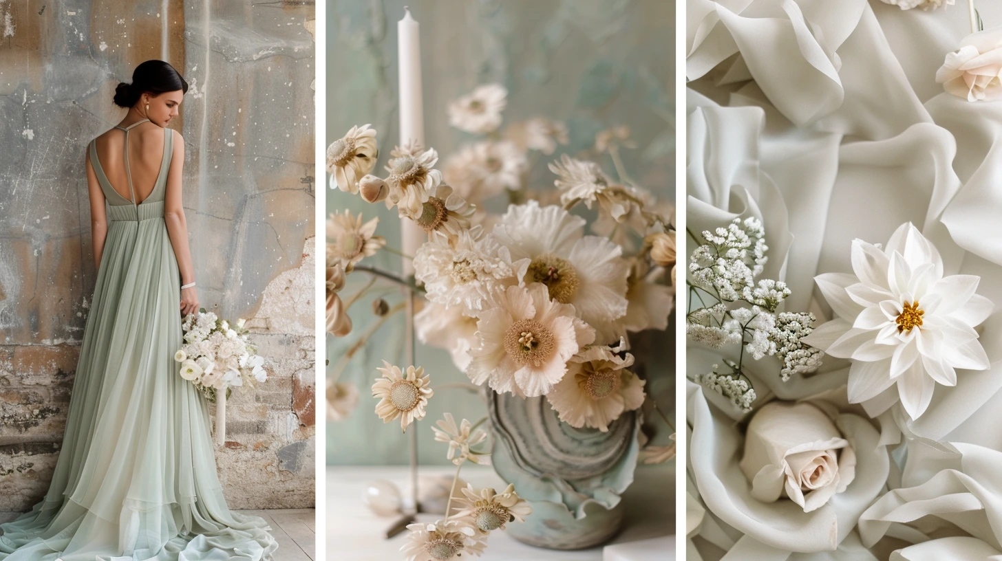
Article idea exploring how to use sage green across home decor, wedding styling and fashion colour palettes.
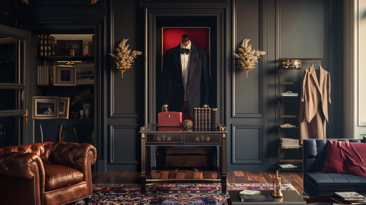
Explore colours that often feel expensive, refined and elegant in interiors and fashion, from camel and navy to ivory, burgundy, chocolate and deep green.
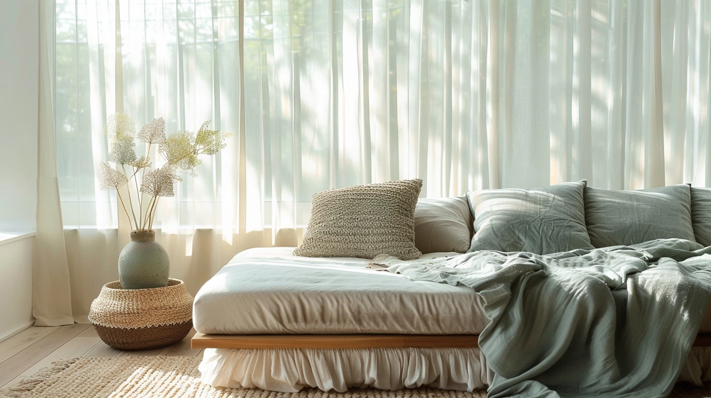
Discover calming colours for interiors, including soft green, muted blue, warm white, taupe, clay, lavender and gentle earth tones.
Explore the psychological meaning of colours, including blue, green, red, yellow, purple, black, white, pink, orange and brown.
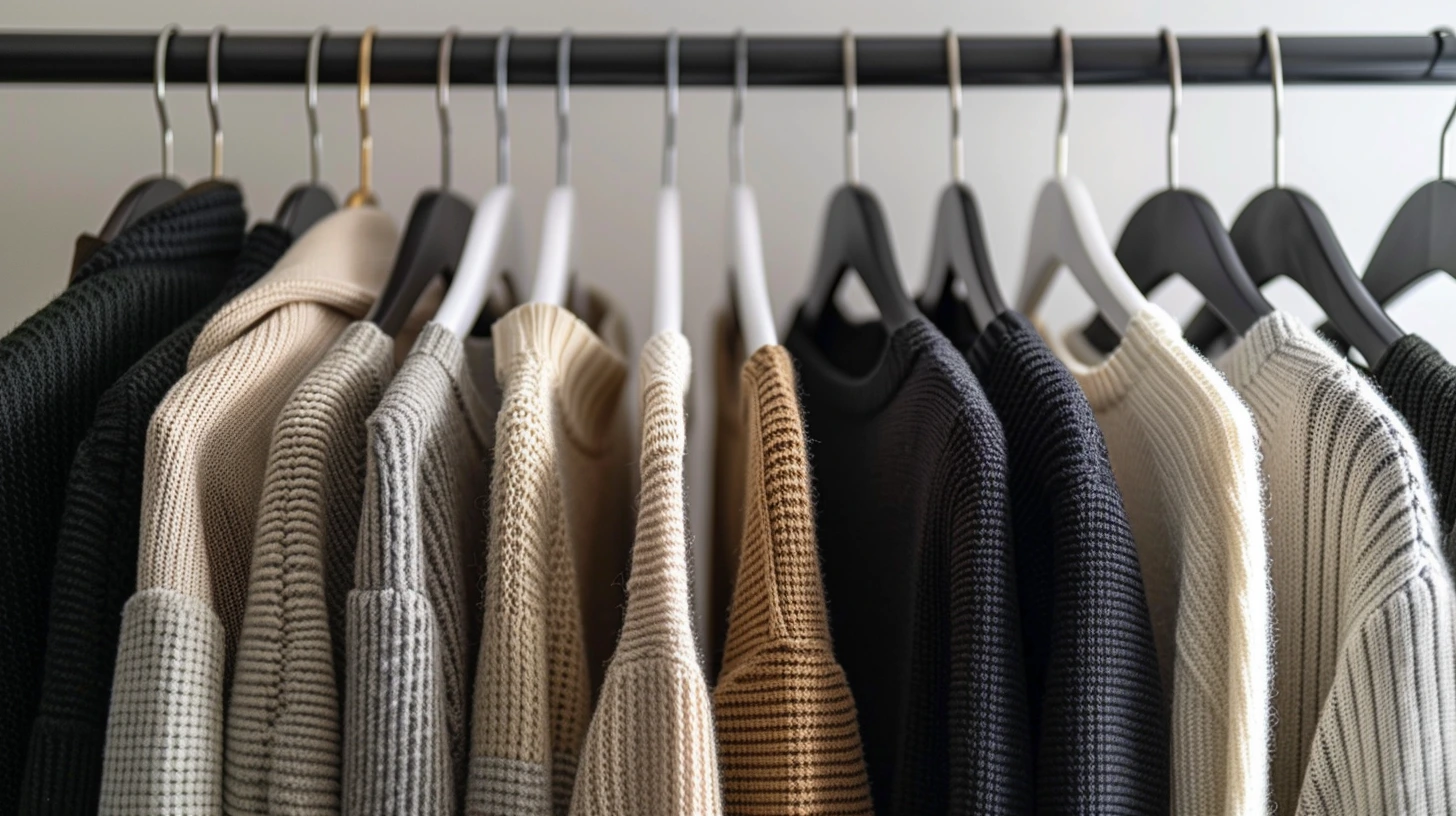
Build a capsule wardrobe colour palette using versatile base colours, supporting neutrals and accent shades that work across seasons.
Explore individual colours such as sage, navy, terracotta, burgundy, lavender, gold, green, blue and more.
Explore coloursExplore company and brand-inspired colour systems for mood boards, creative direction and visual research.
Explore companiesDiscover sports team palettes across football, basketball, baseball, American football and Formula 1.
Explore teamsBrowse country and flag colour schemes for events, campaigns, posters and themed design work.
Explore flagsFind palettes for living rooms, bedrooms, kitchens, bathrooms, hallways and practical decorating ideas.
Explore interiorsPlan capsule wardrobes, seasonal outfits, quiet luxury looks and everyday colour combinations.
Explore fashionBrowse digital logo and social platform colour references for visual inspiration.
Explore logosExplore common paint colours, wall shades, accent colours and combinations that work well together.
Explore paintsExplore common paint colours, wall shades, accent colours and combinations that work well together.
Explore paintsExplore combinations for luxury, fintech, editorial, wellness, gaming, seasonal and creative work.
Explore schemesBrowse palette ideas for mood boards, brands, rooms, websites, outfits and presentations.
Explore examplesWarm White Paint colour palette inspiration for design, styling and creative projects.
View palette →Soft White Paint colour palette inspiration for design, styling and creative projects.
View palette →Chalk White Paint colour palette inspiration for design, styling and creative projects.
View palette →Alabaster Paint colour palette inspiration for design, styling and creative projects.
View palette →Swiss Coffee Inspired Paint colour palette inspiration for design, styling and creative projects.
View palette →Ivory Paint colour palette inspiration for design, styling and creative projects.
View palette →Linen Paint colour palette inspiration for design, styling and creative projects.
View palette →Parchment Paint colour palette inspiration for design, styling and creative projects.
View palette →Alabaster paint colour inspiration for interiors, walls, accents and decorating schemes.
View palette →Beige paint colour inspiration for interiors, walls, accents and decorating schemes.
View palette →Ivory paint colour inspiration for interiors, walls, accents and decorating schemes.
View palette →Linen White paint colour inspiration for interiors, walls, accents and decorating schemes.
View palette →Dove Grey paint colour inspiration for interiors, walls, accents and decorating schemes.
View palette →Eggshell paint colour inspiration for interiors, walls, accents and decorating schemes.
View palette →Greige paint colour inspiration for interiors, walls, accents and decorating schemes.
View palette →Pewter paint colour inspiration for interiors, walls, accents and decorating schemes.
View palette →Red colour palette ideas for interiors, fashion, branding, websites and creative projects.
View palette →Warm Grey colour palette ideas for interiors, fashion, branding, websites and creative projects.
View palette →Blue colour palette ideas for interiors, fashion, branding, websites and creative projects.
View palette →Cool Grey colour palette ideas for interiors, fashion, branding, websites and creative projects.
View palette →Green colour palette ideas for interiors, fashion, branding, websites and creative projects.
View palette →Mushroom colour palette ideas for interiors, fashion, branding, websites and creative projects.
View palette →Putty colour palette ideas for interiors, fashion, branding, websites and creative projects.
View palette →Yellow colour palette ideas for interiors, fashion, branding, websites and creative projects.
View palette →