Copied
Common Interior Palettes

Elegant Fresh Mint Kitchen Palette Colour Palette

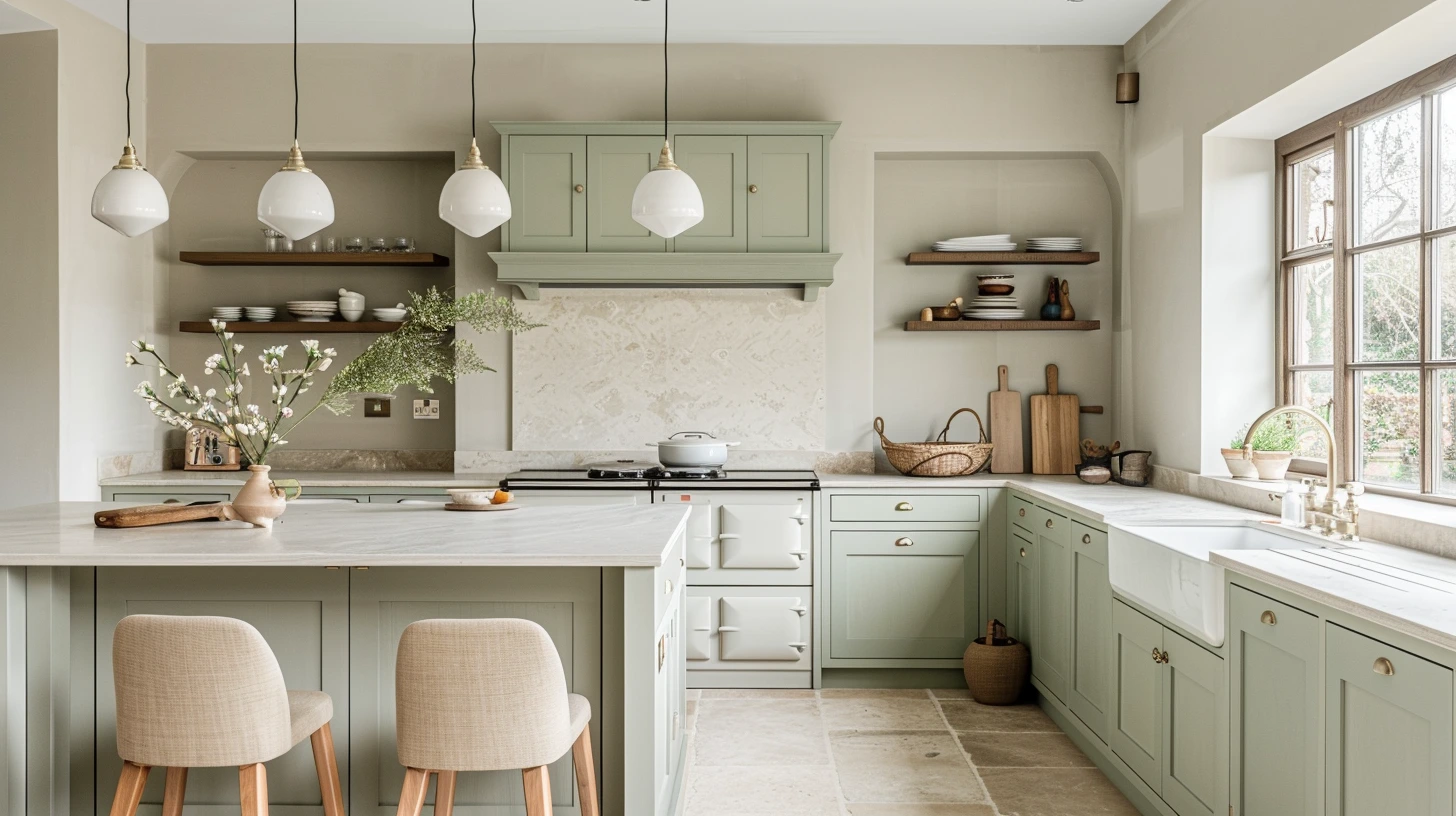
Elegant Fresh Mint Kitchen Palette interior colour palette for room schemes, decorating ideas and home mood boards.

Open the colour tool

About this palette

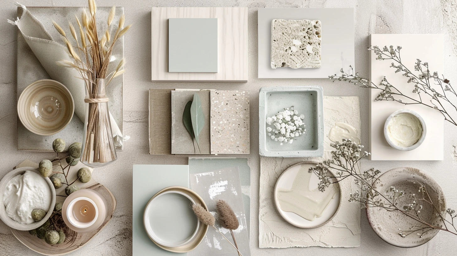
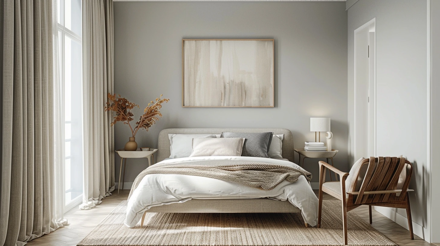
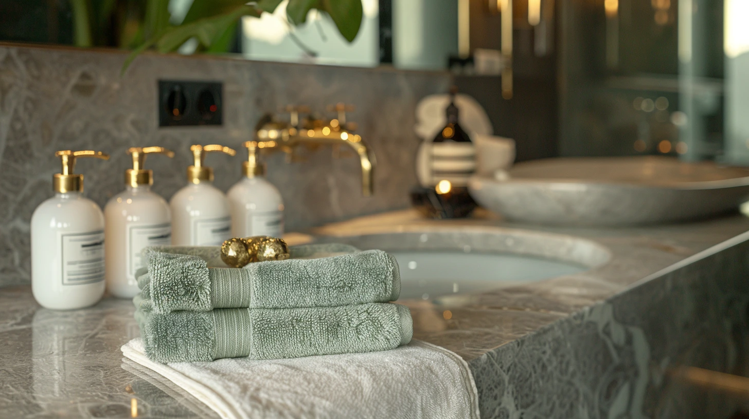
The Elegant Fresh Mint Kitchen Palette palette is designed for room schemes, decorating ideas and home mood boards. It combines base tones, accent colours and contrast shades to help create a more considered interior colour direction.

This palette works especially well for themes such as interior, kitchen, mint, fresh, elegant. The included colours are #064E3B, #FFFFFF, #ECFDF5, #A7F3D0, #10B981.

You can also explore related common interior palettes, open the palette in the colour tool, or compare it with articles that use similar colour ideas.

Colours in this palette

Click any colour to copy the HEX value, or open the full palette in the colour tool to test harmonies, contrast and CSS export options.

Base colour
Supporting colour
Supporting colour
Supporting colour
Supporting colour

How to use this palette

  • For walls: use the softer or lighter tones as the main wall colour, especially in smaller rooms or rooms with limited natural light.
  • For accents: use the richer shades on furniture, cabinetry, cushions, artwork, rugs or feature walls.
  • For balance: repeat at least one colour in more than one place so the room feels intentional.

CSS colour variables

Copy these variables into your stylesheet or design system.

:root {
  --palette-colour-1: #064E3B;
  --palette-colour-2: #FFFFFF;
  --palette-colour-3: #ECFDF5;
  --palette-colour-4: #A7F3D0;
  --palette-colour-5: #10B981;
}

Similar colour palettes

These palettes share similar tags or colour ideas, so they are useful next steps if you want a related look.

Articles that explore similar colours

Read more colour stories, design guides and palette ideas that connect to this page.

Terracotta Colour Schemes for Warm Earthy Rooms colour palette inspiration
Terracotta Colour Schemes for Warm Earthy Rooms
Terracotta brings warmth, craft and Mediterranean energy into a space, especially when paired with chalky neutrals.
4 min read · 3 August 2026
Navy Blue Interior Palettes That Feel Rich Not Heavy colour palette inspiration
Navy Blue Interior Palettes That Feel Rich Not Heavy
Navy can make a room feel tailored, deep and expensive, but it needs warm balance to avoid feeling flat.
4 min read · 27 July 2026
Sage Green Colour Palettes for Calm Modern Homes colour palette inspiration
Sage Green Colour Palettes for Calm Modern Homes
Sage green has become a modern decorating favourite because it feels fresh without being loud and calm without bein…
4 min read · 20 July 2026
How to Choose a Colour Palette for a Living Room That Feels Finished colour palette inspiration
How to Choose a Colour Palette for a Living Room That Feels Finished
Living room colour works best when it has structure: a base, a bridge, an accent and a small moment of contrast.
4 min read · 13 July 2026
Nature-Inspired Colour Palettes for Calm, Beautiful Spaces colour palette inspiration
Nature-Inspired Colour Palettes for Calm, Beautiful Spaces
Article idea exploring forest, ocean, desert, garden and sunset-inspired colour palettes for interiors and creative…
4 min read · 6 July 2026
Brand Colour Palettes for Small Businesses colour palette inspiration
Brand Colour Palettes for Small Businesses
Article idea helping small businesses choose brand colours for websites, logos, packaging and social media.
4 min read · 29 June 2026