Copied
Material and Finish Palettes

Travertine and Plaster Colour Palette

Travertine and Plaster colour palette with practical hex codes for bathrooms, spas, interiors and understated luxury.

Open the colour tool

About this palette

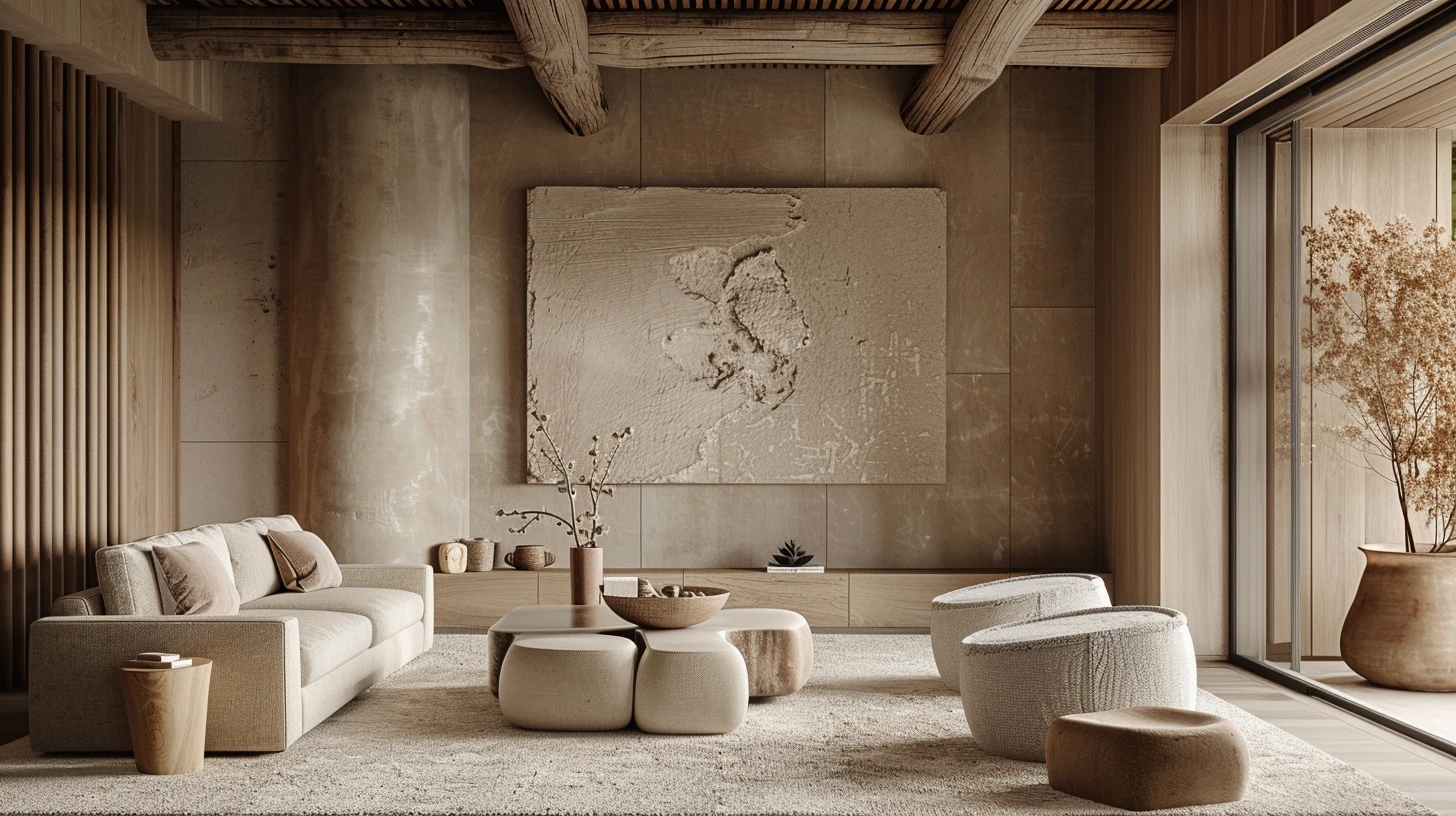
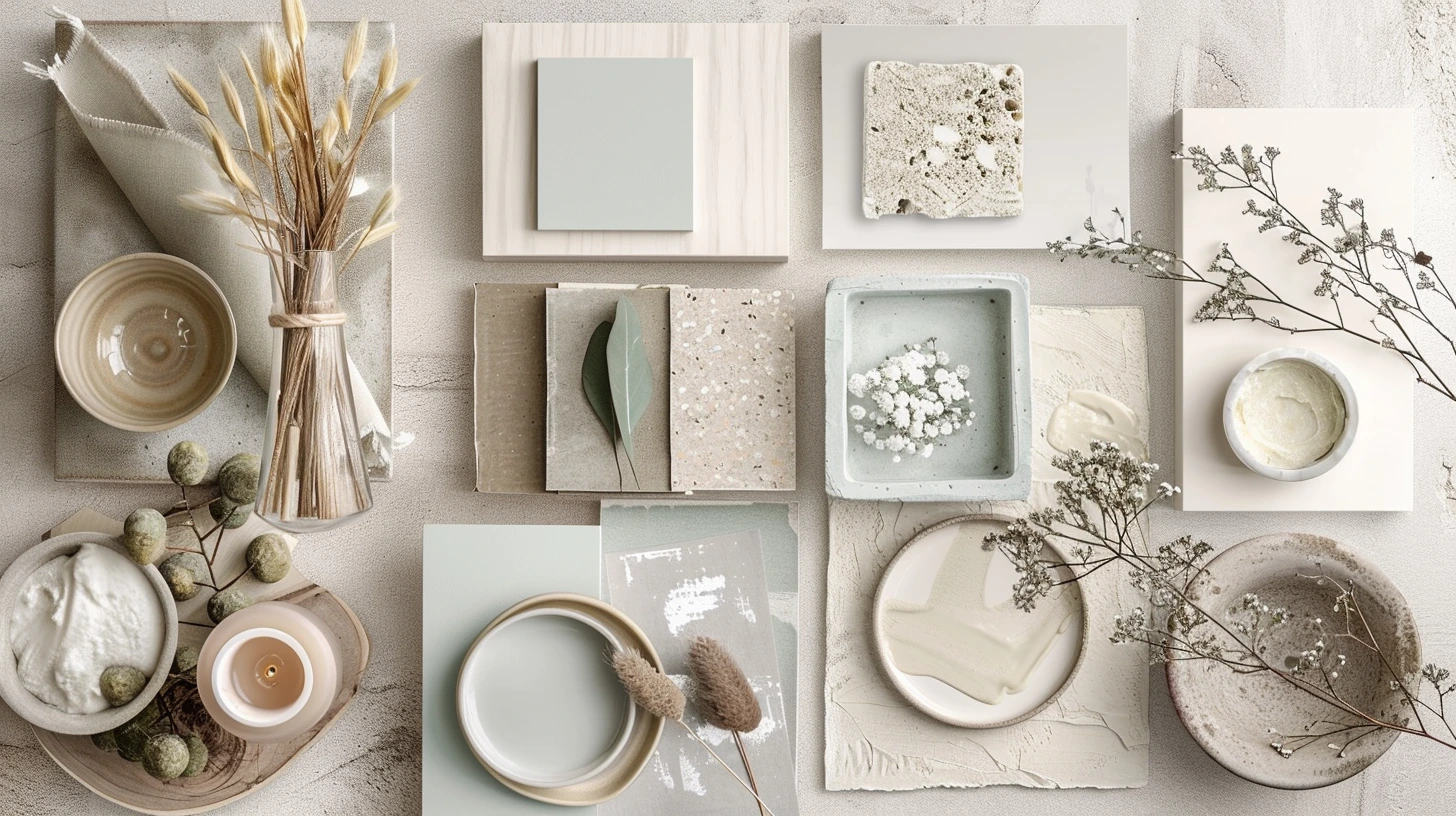
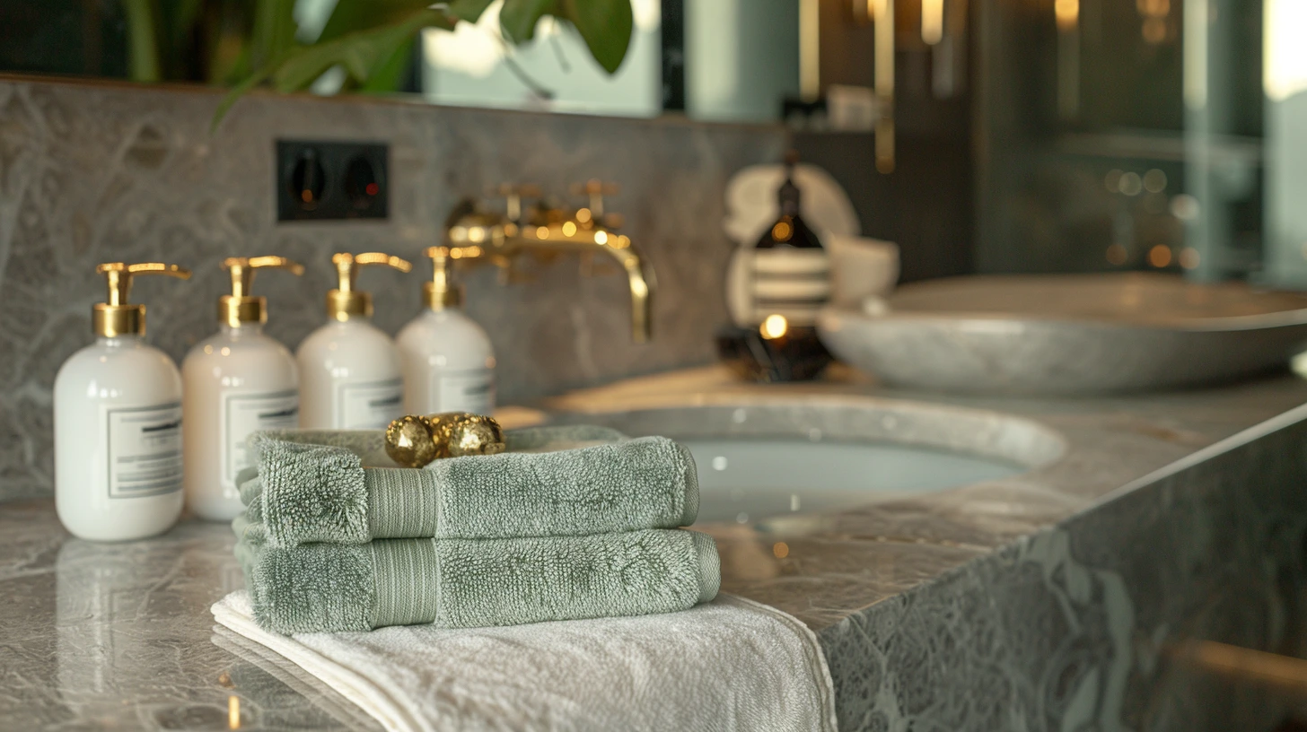
Travertine and Plaster is a curated five-colour palette designed for bathrooms, spas, interiors and understated luxury. The low-contrast stone range relies on texture and subtle temperature shifts rather than strong colour separation.

The colours are #D6C0A8, #E8D9C7, #BCA98C, #8F7A66, #F5EFE7. Use the darkest and lightest values to establish hierarchy first, then introduce the supporting colours for accents, surfaces and visual rhythm.

You can also explore related material and finish palettes, open the palette in the colour tool, or compare it with articles that use similar colour ideas.

Colours in this palette

Click any colour to copy the HEX value, or open the full palette in the colour tool to test harmonies, contrast and CSS export options.

Anchor / darkest
Primary
Secondary
Soft surface
Light / neutral

How to use this palette

  • For creative direction: use this palette as a starting point for mood boards, brand concepts, web pages, graphics and presentations.
  • For digital design: test the strongest colours against light and dark text before using them in buttons or headings.
  • For consistency: assign each colour a job, such as background, text, accent, highlight or supporting neutral.

CSS colour variables

Copy these variables into your stylesheet or design system.

:root {
  --palette-colour-1: #D6C0A8;
  --palette-colour-2: #E8D9C7;
  --palette-colour-3: #BCA98C;
  --palette-colour-4: #8F7A66;
  --palette-colour-5: #F5EFE7;
}

Similar colour palettes

These palettes share similar tags or colour ideas, so they are useful next steps if you want a related look.

Articles that explore similar colours

Read more colour stories, design guides and palette ideas that connect to this page.

How to Build a Colour Palette from Wood, Stone, Metal and Fabric
Use real materials as the starting point for colour palettes, with 10 combinations built around walnut, oak, traver…
3 min read · 14 August 2026
Room-by-Room Colour Palettes: Choose Colours for the Light and Materials You Have
Choose colour palettes for north-facing and south-facing living rooms, small bedrooms, hallways, kitchens, bathroom…
3 min read · 14 August 2026
Colour Theory Without the Jargon: 10 Palettes That Show How It Works
Learn analogous, complementary, split-complementary, triadic, monochrome, saturation, undertones, tints, tones and …
3 min read · 14 August 2026
Colour Palettes from Art and Design History You Can Still Use Today
Explore 10 palettes inspired by Bauhaus, Art Deco, Arts and Crafts, Impressionism, Renaissance fresco, Dutch Golden…
3 min read · 14 August 2026
10 Travel Colour Palettes Inspired by Places Around the World
Explore colour palettes inspired by the Amalfi Coast, Iceland, Kyoto, Marrakech, the Scottish Highlands, Santorini,…
3 min read · 14 August 2026
Restaurant and Food Brand Colour Palettes That Make People Want to Look Closer
Explore 10 food and drink palettes for restaurants, cafés, bakeries, coffee roasters, wine bars, breweries, sushi, …
3 min read · 14 August 2026

Explore more colour directions

Move beyond this palette and browse other live Palette Burst categories, using real colours from the database rather than a generic placeholder strip.