Copied
Company Palettes

X Colour Palette

X colour palette inspiration with recognisable brand-style colours for mood boards, comparison and creative direction.

Open the colour tool

About this palette

This X palette is a practical, brand-inspired reference for visual research, mood boards and comparative design work. The colours shown are #000000, #FFFFFF, #71767B.

Use the palette to study how a recognisable social platform can combine a dominant identity colour with neutrals and supporting accents. It is an inspiration resource rather than an official brand-guideline specification, so check the brand owner's current standards before production use.

You can also explore related company palettes, open the palette in the colour tool, or compare it with articles that use similar colour ideas.

Colours in this palette

Click any colour to copy the HEX value, or open the full palette in the colour tool to test harmonies, contrast and CSS export options.

Primary brand colour
Supporting brand colour
Neutral / supporting colour

How to use this palette

  • For inspiration: use this as a brand-style reference rather than official brand guidance.
  • For mood boards: compare the bright colours with the neutral colours to understand how the identity creates contrast.
  • For design systems: test contrast before using any colour combination for text, buttons or interface components.

CSS colour variables

Copy these variables into your stylesheet or design system.

:root {
  --palette-colour-1: #000000;
  --palette-colour-2: #FFFFFF;
  --palette-colour-3: #71767B;
}

Similar colour palettes

These palettes share similar tags or colour ideas, so they are useful next steps if you want a related look.

Articles that explore similar colours

Read more colour stories, design guides and palette ideas that connect to this page.

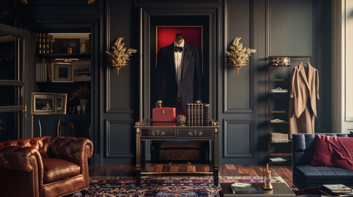
Colours That Look Expensive in Interiors and Fashion colour palette inspiration
Colours That Look Expensive in Interiors and Fashion
Explore colours that often feel expensive, refined and elegant in interiors and fashion, from camel and navy to ivo…
4 min read · 1 June 2026
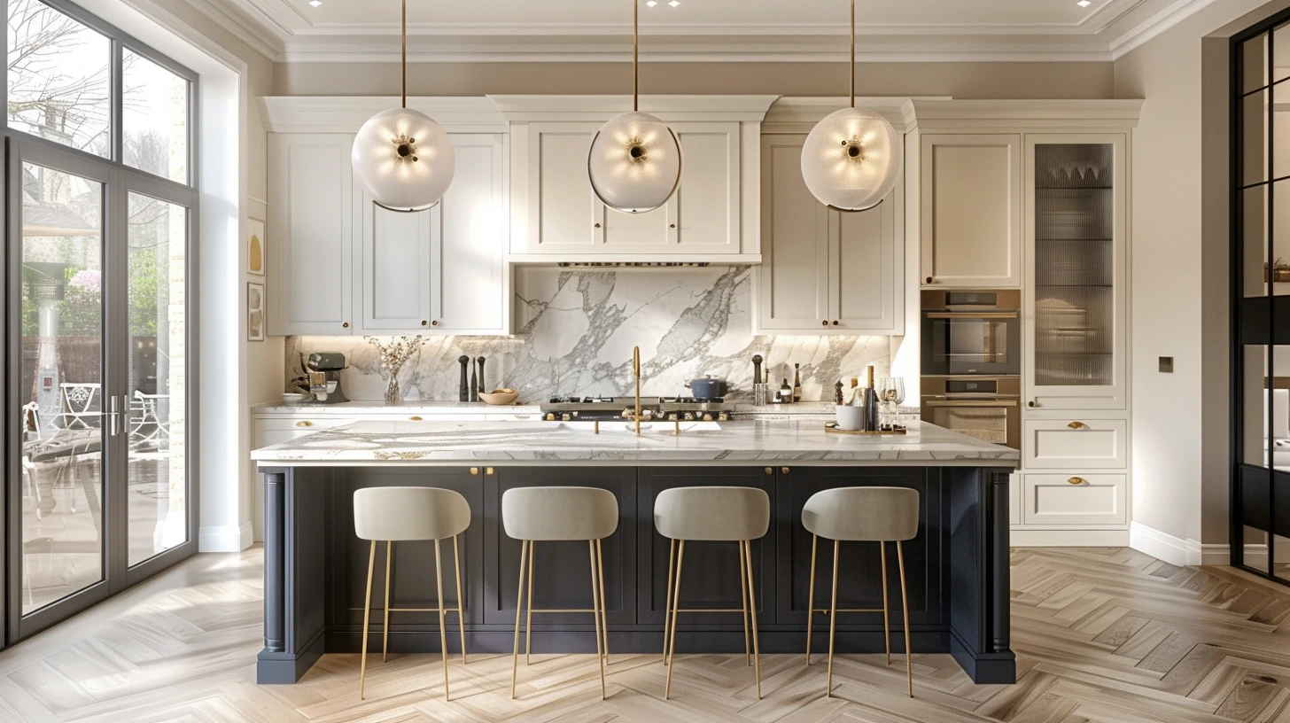
A timeless kitchen with green cabinetry, marble worktops and warm brass hardware
Kitchen Colour Combinations That Look Timeless, Fresh and Expensive
Explore kitchen colour combinations that feel timeless and stylish, including green and marble, navy and brass, war…
5 min read · 25 April 2026
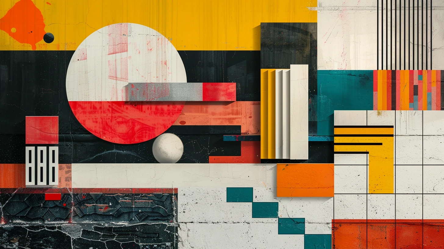
Colour Palettes from Art and Design History You Can Still Use Today
Explore 10 palettes inspired by Bauhaus, Art Deco, Arts and Crafts, Impressionism, Renaissance fresco, Dutch Golden…
3 min read · 14 August 2026
10 Travel Colour Palettes Inspired by Places Around the World
Explore colour palettes inspired by the Amalfi Coast, Iceland, Kyoto, Marrakech, the Scottish Highlands, Santorini,…
3 min read · 14 August 2026
Restaurant and Food Brand Colour Palettes That Make People Want to Look Closer
Explore 10 food and drink palettes for restaurants, cafés, bakeries, coffee roasters, wine bars, breweries, sushi, …
3 min read · 14 August 2026
Accessible Colour Palettes: How to Create Contrast Without Making a Site Ugly
Learn how to build accessible colour palettes with strong text contrast, clear actions and better status design, wi…
3 min read · 14 August 2026

Explore more colour directions

Move beyond this palette and browse other live Palette Burst categories, using real colours from the database rather than a generic placeholder strip.