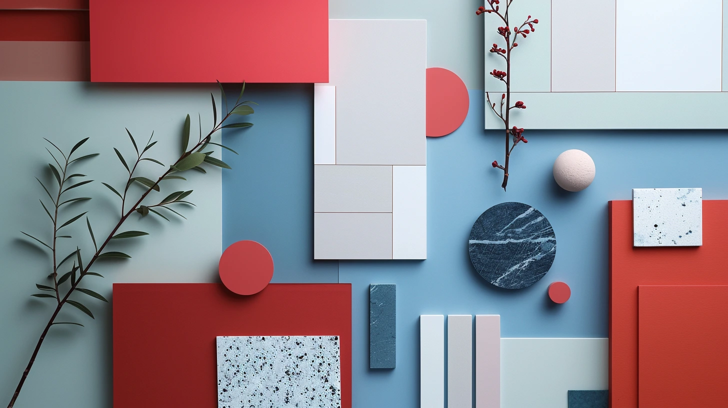
Sobre esta paleta
Accessible High Contraste UI is a curated five-colour paleta designed for public services, forms, accessibility-first products and high-clarity interfaces. Black and white establish maximum clarity while blue and amber provide strong action and attention cues.
The colours are #000000, #FFFFFF, #005FCC, #FFBF47, #E5E7EB. Usar the darkest and lightest values to establish hierarchy first, then introduce the supporting colours for accents, surfaces and visual rhythm.
You can also explore related paletas para sites e interfaces, open the paleta in the colour tool, or compare it with articles that use similar colour ideas.