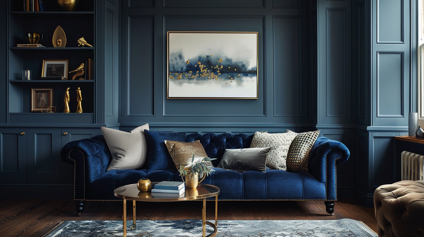
Navy Blue Interior Palettes That Feel Rich Not Heavy is not really about finding a perfect colour rule. It is about understanding the mood you want to create, the setting the colours have to live in and the small details that can make a palette feel natural rather than forced.
Navy can make a room feel tailored, deep and expensive, but it needs warm balance to avoid feeling flat.
Start with the feeling of the space
With navy blue interior palettes that feel rich not heavy, begin with the room before you begin with the colour. Think about the light, the flooring, the furniture you already own and the time of day when the space is used most. A colour that feels beautiful in a bright image can behave very differently beside your sofa, curtains or a cool north-facing window.
Interior colour works best when it feels layered. The wall colour might set the mood, but woodwork, upholstery, rugs, lampshades, metals and artwork all change the final result. This is why a simple palette can feel expensive when the materials are right, and a complicated palette can feel messy when too many shades are competing.
Give each colour a role
A useful room palette usually has a quiet base, a supporting tone, a grounding shade and one accent. The base might be warm white, stone, oatmeal or soft grey. The supporting tone might be sage, navy, terracotta, blue or mushroom. The grounding shade might be charcoal, walnut, dark bronze or black. The accent should be used with restraint.
This is not a rigid formula; it is a way of stopping the room from feeling accidental. If everything is pale, the room can drift. If everything is strong, the room can feel restless. A grounding note gives the eye somewhere to land, while a softer tone gives the palette somewhere to breathe.
Notice the quiet colours already in the room
The colours you did not choose often matter most: the floor, window frames, stone around a fireplace, undertone of a sofa, colour of a lampshade or metal finish on a handle. These quiet colours are already part of the palette. If you ignore them, even a beautiful wall colour can feel slightly wrong.
Examples that show why it works
Try navy, cream, tan and brass. This works because navy brings depth, cream gives breathing space, tan adds warmth and brass stops the scheme feeling flat. It gives the palette a clear direction rather than a random collection of shades.
Try navy, pale blue, white and oak. This works because the lighter blues soften navy so it feels fresh rather than formal. It gives the palette a clear direction rather than a random collection of shades.
Try navy, burgundy, ivory and walnut. This works because a richer combination that feels tailored and evening-ready. It gives the palette a clear direction rather than a random collection of shades.
The mistake to avoid
The most common mistake is adding colour because something feels unfinished. Often the answer is not another colour at all. It might be more texture, a darker grounding note, better lighting, more breathing space or repeating a colour that is already present.
Another mistake is judging a palette in isolation. Colours behave differently on a wall, a fabric, a phone screen, a printed card or a glossy tile. Before committing, test the palette in the place it will actually be used.
How to make the palette feel more human
A good palette should not feel as if it came straight from a chart. Add something imperfect or lived-in: wood grain, linen, an old book, a ceramic object, a worn leather detail, a softer neutral, a handwritten card, a photograph or a natural material. These details stop colour from feeling sterile.
The best palettes usually have a little tension too. A calm room might need one dark lamp. A neutral outfit might need a burgundy shoe. A clean website might need one warmer accent. That small moment of contrast makes the whole thing feel more considered.
A simple way to use it
If you are working with navy blue interior palettes that feel rich not heavy, choose one colour to lead, one to soften, one to ground and one to create interest. Then reduce anything that does not support that story. Colour becomes much easier when every shade has a reason to be there.
The final test is not whether the palette looks clever. It is whether it feels right in real life: in the room, on the outfit, on the screen, in the brand, or in the moment someone actually experiences it.
Keep exploring colour
Continue from this article into related palettes and colour guides already available on Palette Burst.