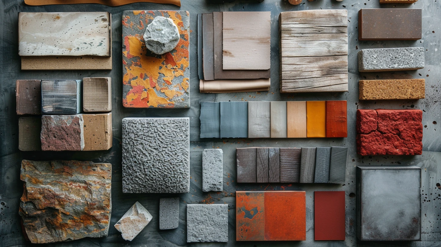
Materials are often a better starting point for a room than paint. Walnut already contains multiple browns. Travertine has cream, beige and grey movement. Brass changes with reflection. Linen, leather, velvet and plaster all absorb light differently. If you begin with those real surfaces, the resulting palette tends to feel layered instead of artificially matched.
Sample the range, not one pixel
A wood plank or stone slab rarely has one colour. Look for the lightest tone, darkest tone and one mid-tone that repeats across the surface. Those three values give you a natural starting hierarchy.
For walnut, the darkest brown can inform joinery or a deep wall colour, the mid brown can connect to leather, and the lighter tone can guide cream or taupe textiles.
Separate colour from finish
Chrome and brushed nickel may be similar in hue but behave differently because one reflects more light. Matte black and glossy black create different visual weight. Velvet looks deeper than flat paint in the same approximate colour because the pile changes with light direction.
When translating a material into a digital or paint palette, remember that the hex value only captures colour, not texture, sheen or reflection.
Use one material as the anchor
Rooms become confusing when every material is treated as a separate feature. Choose one dominant anchor such as oak, marble, terracotta or walnut. Let the other finishes support it through either similarity or deliberate contrast.
Oak and linen naturally harmonise. Carrara marble and navy create stronger contrast. Blackened steel and concrete rely more on texture and value than hue.
Metallics work best as accents
Brass, gold, copper and chrome are usually most effective in smaller areas: handles, lighting, taps, frames and legs. Representing them as large flat digital colours can look harsher than the real material because real metal contains highlight and shadow.
Use the metal-inspired colour to guide the wider palette, but let the physical finish provide the sparkle.
Ten material-led combinations
The palettes below pair familiar materials into coherent colour directions: walnut with brass, oak with linen and sage, travertine with plaster, blackened steel with concrete, marble with navy, terracotta with rattan, leather with walnut, chrome with glass, cork with clay and velvet with brass.
They are especially useful when you already own a key piece of furniture or have fixed finishes that need the rest of the room to make sense around them.
Keep exploring colour
Continue from this article into related palettes and colour guides already available on Palette Burst.