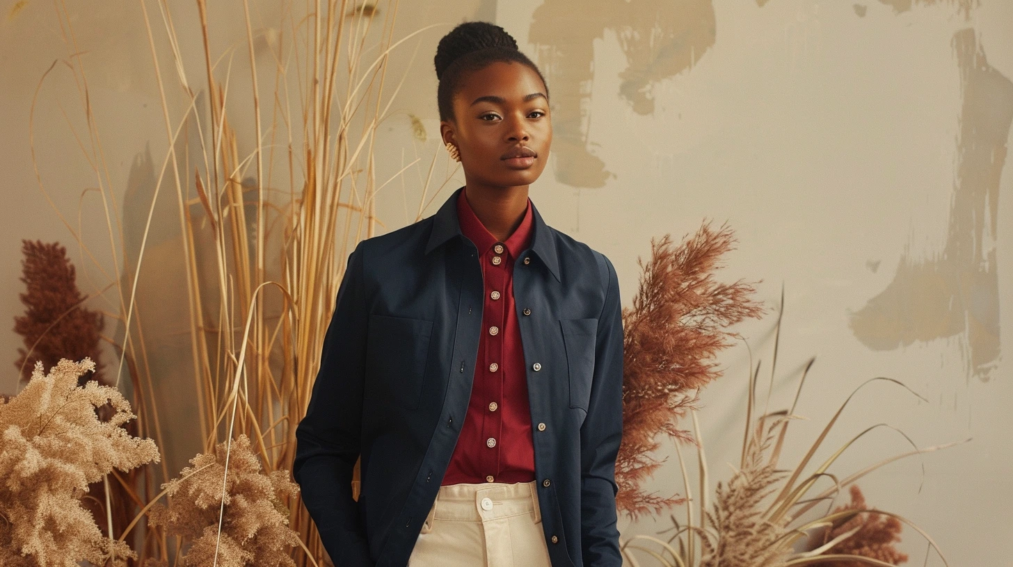
What Colours Go With Navy Clothes is not really about finding a perfect colour rule. It is about understanding the mood you want to create, the setting the colours have to live in and the small details that can make a palette feel natural rather than forced.
Navy is one of the easiest wardrobe anchors because it behaves like black but feels softer and more versatile.
Think about outfits as a palette, not single items
What Colours Go With Navy Clothes works best when you stop judging each piece alone. A jacket, shoe, shirt or dress might look good by itself, but the outfit only feels intentional when the colours speak to each other. The easiest looks normally have one main colour, one quieter support shade and one grounding tone.
This does not mean dressing in a formulaic way. It means giving yourself a colour framework so getting dressed feels easier. Navy, cream and tan can feel classic. Black, white and red can feel graphic. Olive, stone and brown can feel relaxed. The personality comes from texture, cut, proportion and the small details.
Use contrast carefully
The reason some outfits look expensive is often proportion. A strong colour used everywhere can feel loud. A strong colour used once, against a calmer base, feels deliberate. If you are using a brighter shade, let it appear in one clear place: a jumper, bag, shoe, lipstick, scarf or jacket lining.
A wardrobe palette also needs repetition. If tan appears in your shoes, belt and coat buttons, it feels intentional. If burgundy appears only once and everything else is unrelated, it can look stranded. Repeating a colour two or three times is a simple way to make an outfit feel styled without looking overworked.
Texture changes how colour feels
Black wool, black silk and black leather all send different messages. Cream denim, cream cashmere and cream satin behave differently too. When an outfit palette feels flat, you may not need another colour; you may need another surface. Knitwear, suede, polished leather, linen, denim and wool all change the way a colour lands.
Examples that show why it works
Try navy, cream, tan and brass. This works because navy brings depth, cream gives breathing space, tan adds warmth and brass stops the scheme feeling flat. It gives the palette a clear direction rather than a random collection of shades.
Try navy, pale blue, white and oak. This works because the lighter blues soften navy so it feels fresh rather than formal. It gives the palette a clear direction rather than a random collection of shades.
Try navy, burgundy, ivory and walnut. This works because a richer combination that feels tailored and evening-ready. It gives the palette a clear direction rather than a random collection of shades.
The mistake to avoid
The most common mistake is adding colour because something feels unfinished. Often the answer is not another colour at all. It might be more texture, a darker grounding note, better lighting, more breathing space or repeating a colour that is already present.
Another mistake is judging a palette in isolation. Colours behave differently on a wall, a fabric, a phone screen, a printed card or a glossy tile. Before committing, test the palette in the place it will actually be used.
How to make the palette feel more human
A good palette should not feel as if it came straight from a chart. Add something imperfect or lived-in: wood grain, linen, an old book, a ceramic object, a worn leather detail, a softer neutral, a handwritten card, a photograph or a natural material. These details stop colour from feeling sterile.
The best palettes usually have a little tension too. A calm room might need one dark lamp. A neutral outfit might need a burgundy shoe. A clean website might need one warmer accent. That small moment of contrast makes the whole thing feel more considered.
A simple way to use it
If you are working with what colours go with navy clothes, choose one colour to lead, one to soften, one to ground and one to create interest. Then reduce anything that does not support that story. Colour becomes much easier when every shade has a reason to be there.
The final test is not whether the palette looks clever. It is whether it feels right in real life: in the room, on the outfit, on the screen, in the brand, or in the moment someone actually experiences it.
Keep exploring colour
Continue from this article into related palettes and colour guides already available on Palette Burst.