Über diese Palette
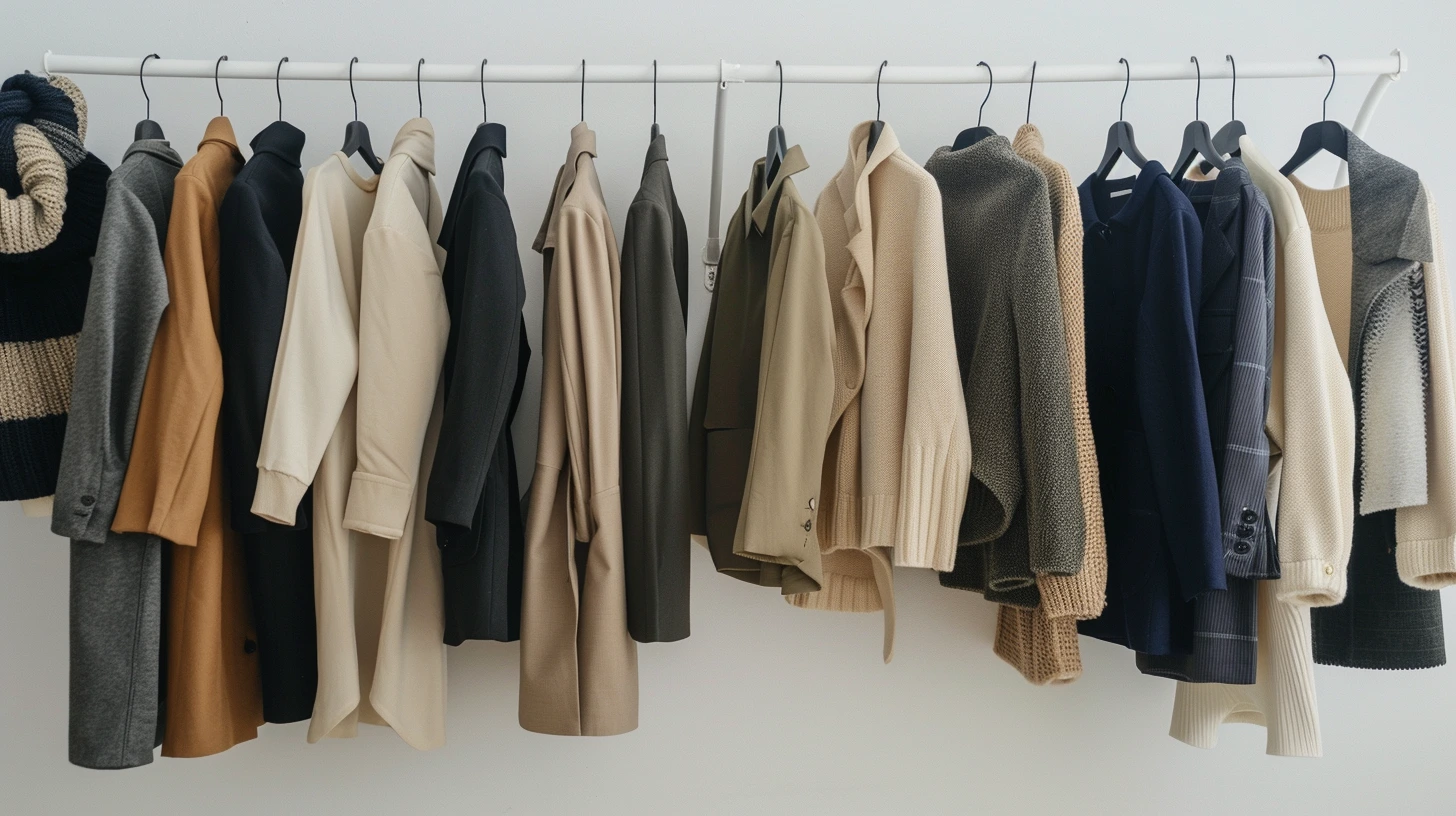
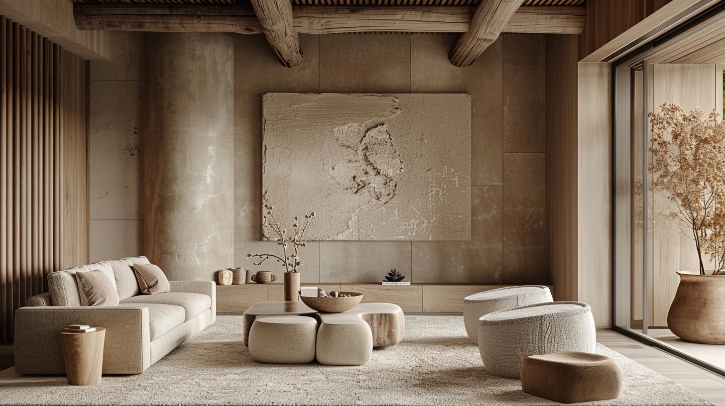
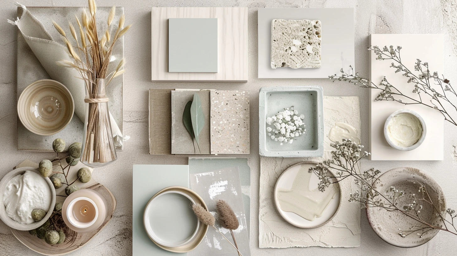
Kyoto Autumn is a curated five-colour Palette designed for autumn travel, editorial, hospitality and interiors. Maple red, persimmon and moss create warmth, while pale parchment gives the colours room to breathe.
The colours are #7A1F1F, #B55239, #D89B3C, #566B3A, #F2E3C6. Verwenden the darkest and lightest values to establish hierarchy first, then introduce the supporting colours for accents, surfaces and visual rhythm.
You can also explore related natur- und reise-Paletten, open the Palette in the colour tool, or compare it with articles that use similar colour ideas.