About this palette
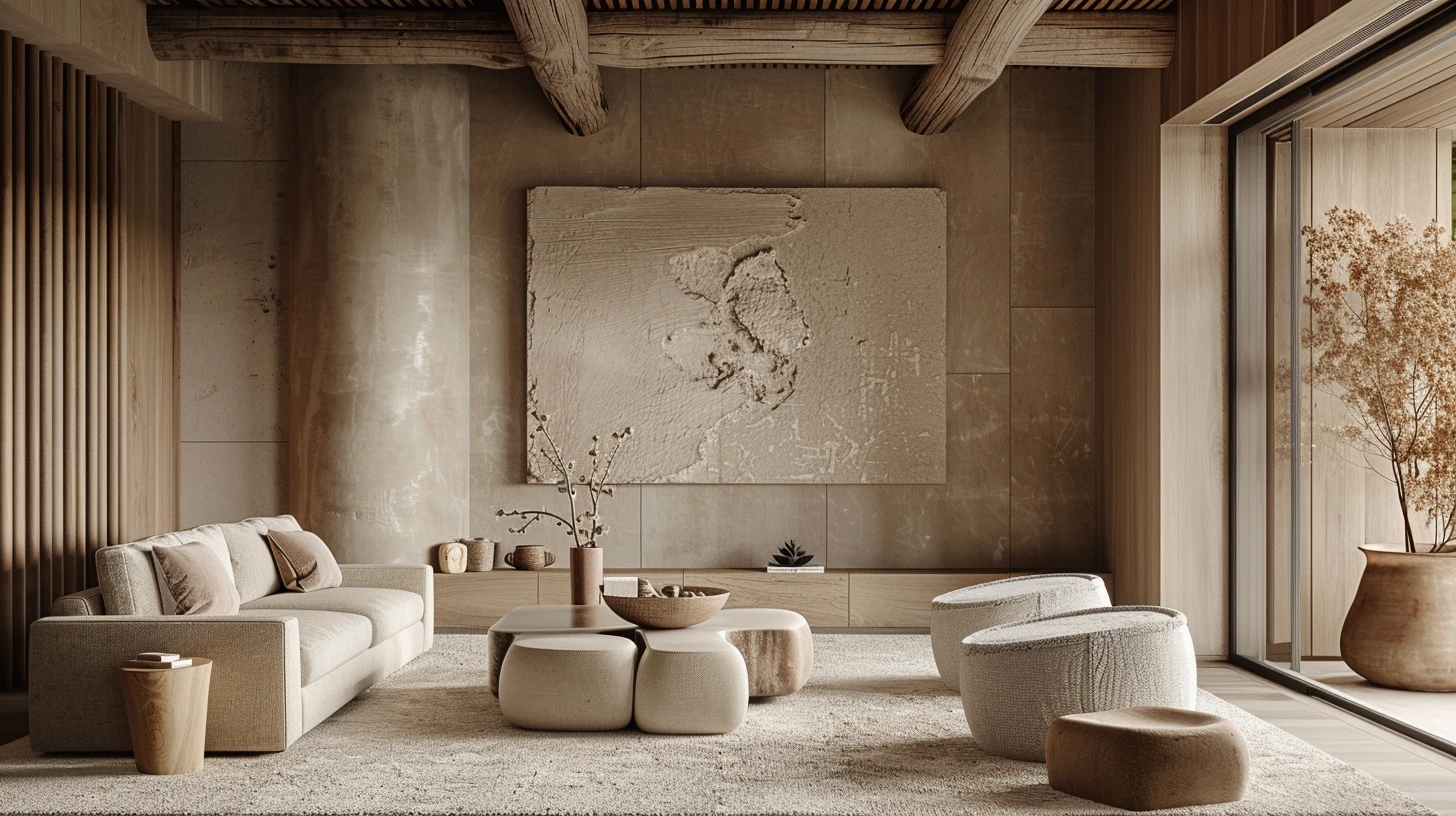
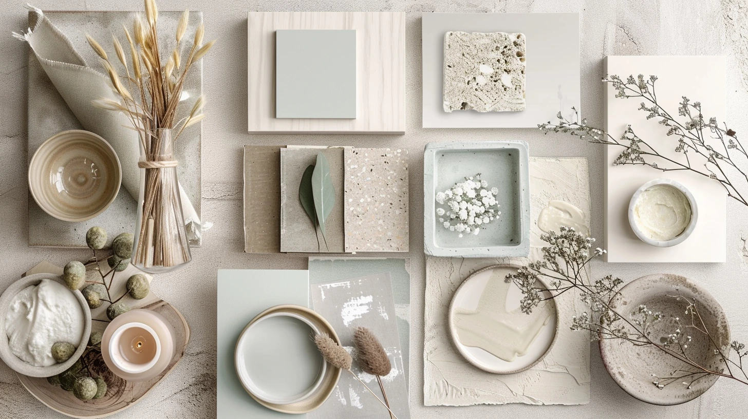
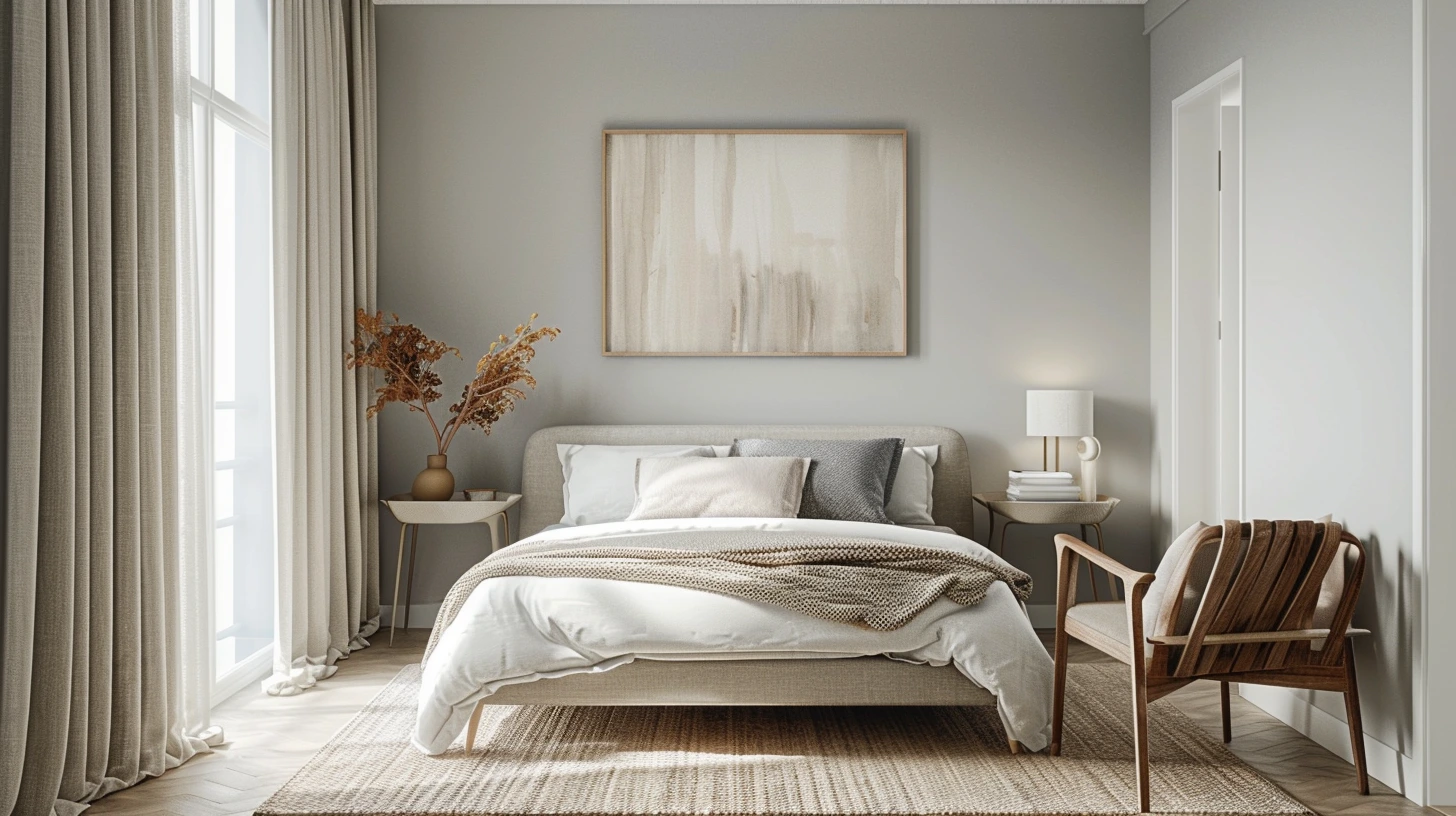
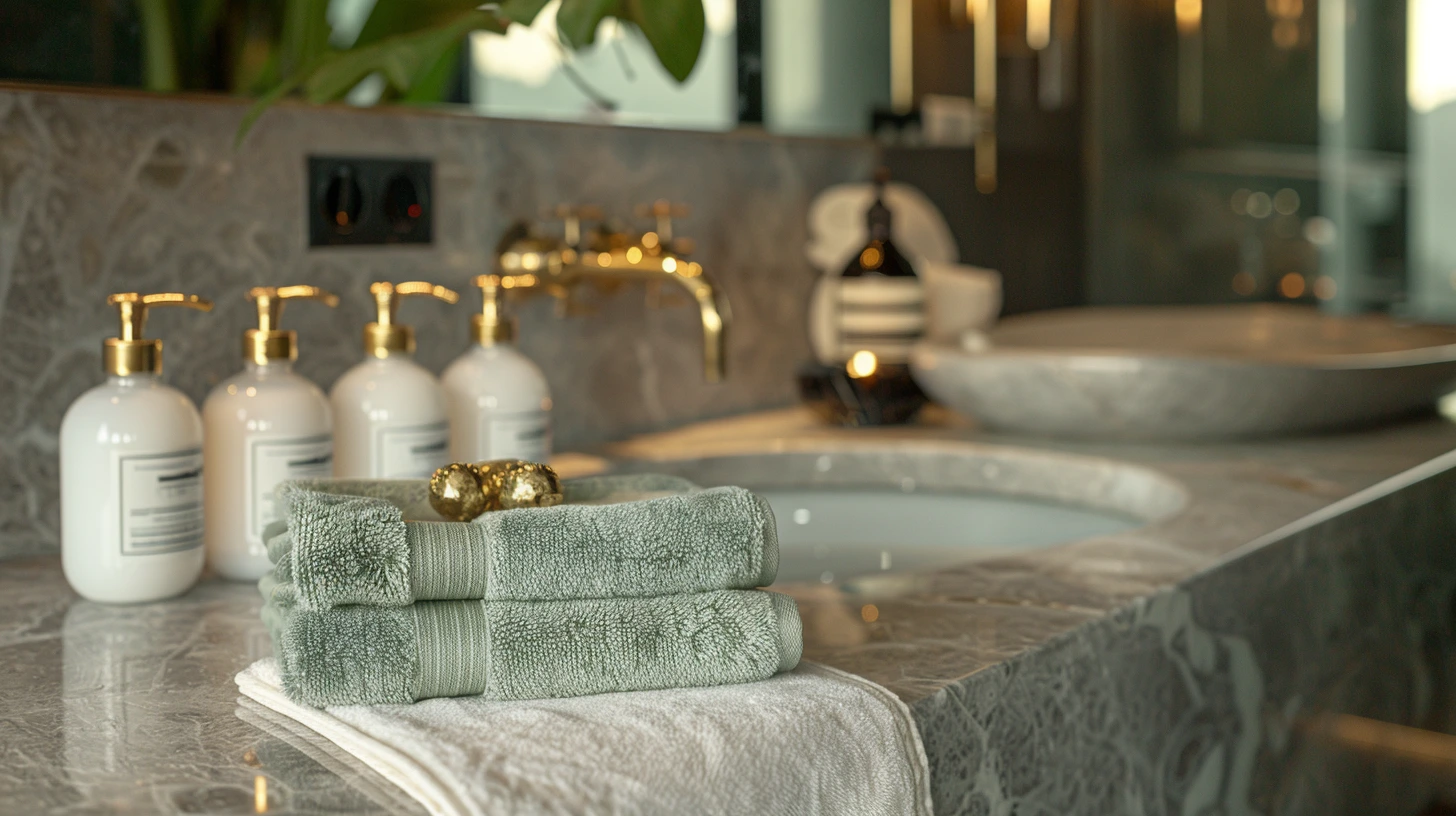
Kyoto Autumn is a curated five-colour palette designed for autumn travel, editorial, hospitality and interiors. Maple red, persimmon and moss create warmth, while pale parchment gives the colours room to breathe.
The colours are #7A1F1F, #B55239, #D89B3C, #566B3A, #F2E3C6. Use the darkest and lightest values to establish hierarchy first, then introduce the supporting colours for accents, surfaces and visual rhythm.
You can also explore related nature and travel palettes, open the palette in the colour tool, or compare it with articles that use similar colour ideas.