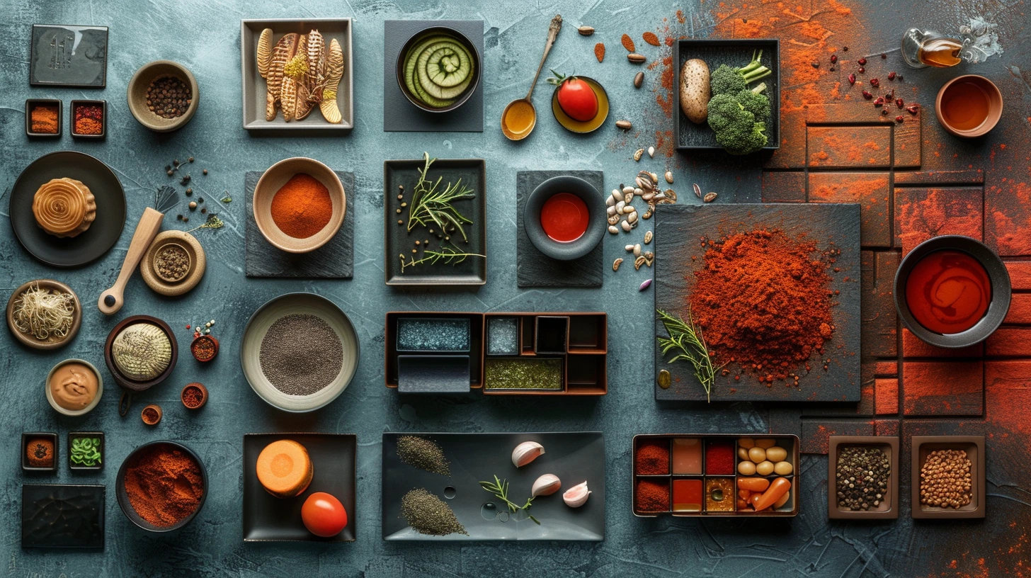
Food colour is unusually powerful because customers already have strong visual memories of ingredients, cooking, packaging and places. Brown can suggest coffee, chocolate or bread. Green can imply herbs, freshness or sustainability. Red can feel hot, ripe or energetic. The challenge is to use those associations without making every Italian restaurant red-white-green and every healthy brand leaf-green.
Start with the eating experience
A fast lunch counter and a two-hour wine bar should not feel the same. Write down the pace, price point and social setting before choosing colours. Quick-service brands often benefit from clearer, higher-energy accents. Premium restaurants can let darker and more muted colours create atmosphere. Bakeries and cafés often work beautifully with warm material colours because flour, crust, coffee and wood already supply a natural visual language.
Borrow from ingredients, but edit
Ingredient colours create useful starting points: tomato red, herb green, citrus yellow, cocoa brown, wine burgundy, rice white, olive green. The trick is to edit them into a system instead of reproducing a plate.
For example, a Mediterranean palette can use sea teal, sun yellow and terracotta without turning into a literal flag or postcard. A sushi palette can rely mostly on ink black and rice white, then use restrained red and sea green.
Packaging needs stronger hierarchy than a mood board
On a shelf or delivery app, the customer may see the brand at a very small size. One recognisable dominant colour or high-contrast combination is usually more valuable than five equal swatches. Decide what should be visible first: brand name, flavour, product type or dietary cue.
If every flavour uses a different colour, keep the master brand colour stable so the range still belongs together.
Use appetite claims carefully
It is tempting to say that a specific colour automatically makes people hungry, but real behaviour depends on context, culture, product, familiarity and the rest of the design. Colour can support expectations, but it is not a guaranteed psychological switch.
Focus on more defensible design questions: does the palette make the food look fresh, rich, premium, comforting, natural or energetic? Does it work beside photography? Does the menu remain readable in low restaurant lighting?
Ten practical directions
The palettes below cover a trattoria, bakery, coffee roastery, natural wine bar, craft taproom, sushi bar, Mediterranean restaurant, Mexican cantina, chocolate patisserie and juice bar. Treat them as starting points and adapt the balance to the venue, food photography and physical materials.
Keep exploring colour
Continue from this article into related palettes and colour guides already available on Palette Burst.