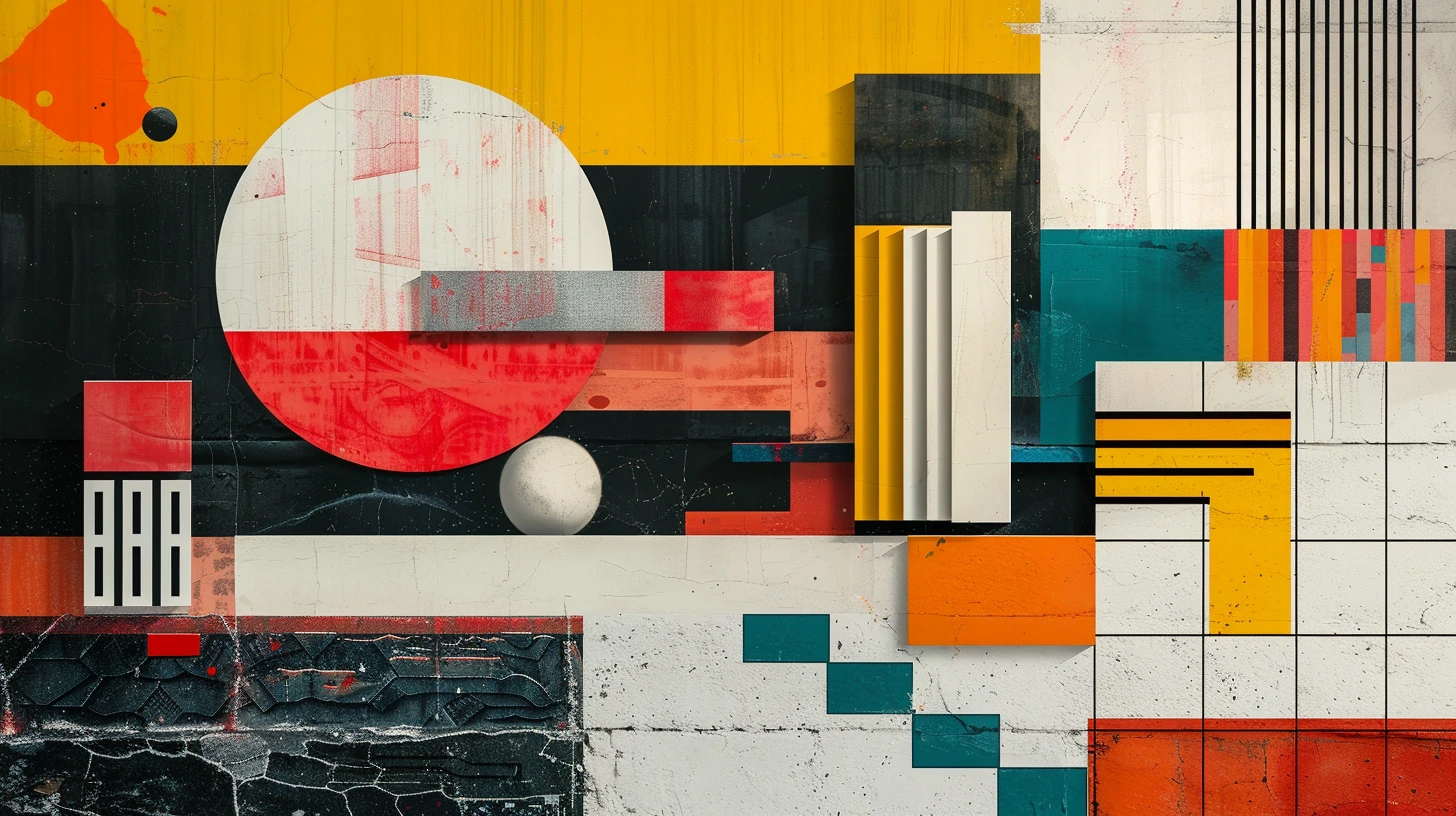
Design history is useful because it shows colour operating inside complete visual systems. A Bauhaus palette is not interesting only because it contains red, yellow and blue. It is interesting because those colours interact with geometry, black type, white space and functional composition. Art Deco is not simply black and gold; it also depends on materials, symmetry, deep jewel tones and contrast.
Borrow the logic, not the costume
Historical inspiration becomes more useful when you identify what the palette is doing. Is it using a dark ground to create dramatic highlights? Is it limiting saturation so pattern can become more complex? Is it using primary colours as structural signals?
Once you understand the logic, you can apply it to a website, room, poster or brand without recreating a period set.
Bauhaus and Pop Art use intensity differently
Both can use strong primary or commercial colours, but their visual intentions differ. Modernist palettes often use colour as an organised structural element. Pop Art embraces the visual language of mass media, print and consumer culture, often pushing saturation and contrast much harder.
That distinction matters when adapting them. Bauhaus-inspired colour can work in a disciplined data or editorial layout; Pop Art may be better for campaigns and cultural graphics where impact is the point.
Muted historical palettes can feel surprisingly modern
Arts and Crafts greens, Renaissance earth pigments and Japanese print-inspired indigo can feel contemporary because natural and muted palettes remain easy to combine with modern typography and materials. They provide character without relying on fashionable digital gradients.
Similarly, Dutch Golden Age-inspired dark grounds can translate beautifully into premium hospitality or editorial design when used with restraint.
Do not claim exact historical colour from a generic hex
Historic pigments, printing, ageing, varnish, lighting and reproduction all affect what we see today. A digital hex palette is an interpretation, not a scientifically exact reconstruction of a painting or period interior.
Use these palettes as creative references. If historical accuracy matters, work from conservation research, pigment analysis and institution-specific sources.
Ten starting points
The collection below turns ten visual traditions into usable five-colour palettes. Try keeping the structure while changing proportion. A Bauhaus-inspired design might be 70 percent white and black with only small primary accents; an Art Deco scheme might let black dominate and reserve gold for the smallest details.
Keep exploring colour
Continue from this article into related palettes and colour guides already available on Palette Burst.