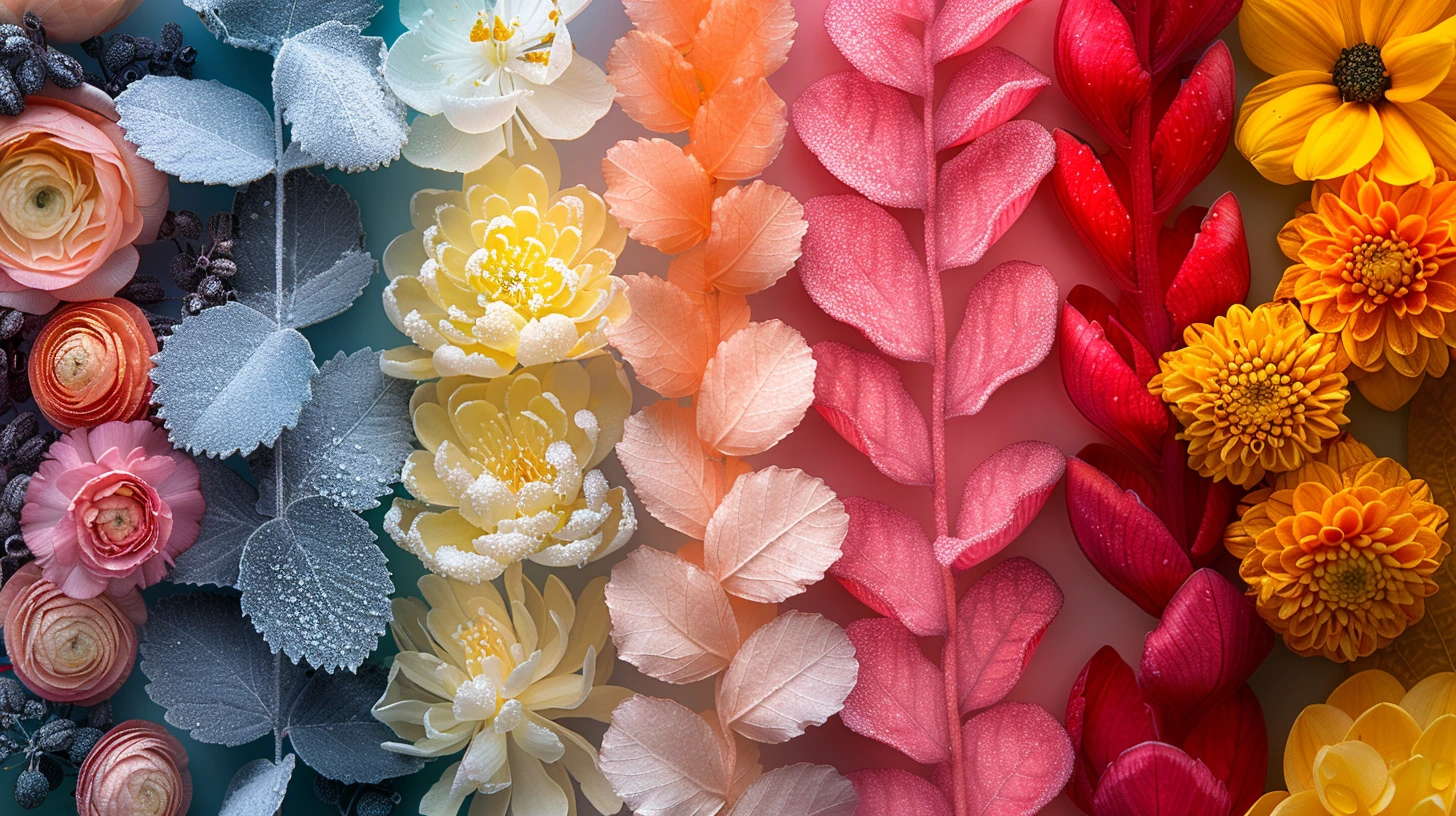
Seasonal design becomes much more useful when it moves beyond the obvious symbols. Spring does not have to mean four pale pastels. Autumn does not have to mean pumpkin orange. Christmas does not have to control the entire winter. A stronger seasonal palette starts with the light, materials, food, clothing and atmosphere people associate with that moment, then chooses colours that can still work in a modern layout.
Keep one colour outside the cliché
If a seasonal palette feels too predictable, introduce one colour that belongs to the wider mood but not the default shorthand. An autumn palette of rust and ochre becomes richer with olive. A winter navy-and-gold palette becomes more contemporary with cool grey. A Valentine palette feels more grown-up when wine red is paired with charcoal rather than only pink.
That extra colour gives the designer somewhere to go when the campaign expands into banners, email, packaging and social content.
Design for the length of the campaign
A one-night event can tolerate a much louder palette than a six-week retail campaign. Strong orange, hot pink or electric cyan may be perfect for a poster but exhausting as a full website background used every day.
For longer campaigns, put seasonal colour mostly into accents, photography treatments, illustrations and promotional modules while keeping navigation and body content stable.
Seasonality is partly about light
Summer palettes can often support clearer, brighter hues because they echo strong daylight. Winter palettes tend to gain atmosphere from darker anchors and higher contrast. Spring benefits from lightness and freshness, while autumn often suits muted warmth and material colours.
These are design observations rather than fixed rules. A winter wellness campaign might be intentionally pale and quiet; a spring sports event might need deep energetic contrast.
Build reusable event roles
Create a dominant colour, a background, a readable text colour, a highlight and a secondary accent. If the event has tickets or calls to action, make sure the action colour remains distinct from decorative highlights.
The palettes below include options for formal, playful and editorial contexts so the same seasonal moment does not force every brand into the same visual language.
Do not forget photographs
Seasonal campaigns frequently include photography, and the image colours become part of the palette. Before finalising a set of swatches, test them over real event imagery. A beautiful pale yellow may disappear over sunlit photographs; a deep burgundy may compete with food or fashion photography.
A good campaign palette should frame the imagery, not fight it.
Keep exploring colour
Continue from this article into related palettes and colour guides already available on Palette Burst.