Bedroom colour has a quieter job than colour in most other rooms. A kitchen can be lively. A hallway can be bold. A living room can have a little theatre. But a bedroom needs to help you land. It should feel like the room is lowering its voice when you walk in.
That does not mean every bedroom has to be pale, plain or minimal. Some bedrooms are beautiful in deep green, smoky blue, warm terracotta or even charcoal. The important thing is that the colours feel settled rather than restless. A good bedroom palette should not keep tapping you on the shoulder. It should make the room feel held together, restful and easy to be in.
It is also worth remembering that a bedroom is not just a room you look at. It is a room you wake up in, get dressed in, retreat to, recover in and see at your most tired. The colours need to feel good in the soft grey of morning and under lamps at night. That is a different brief from choosing a colour that looks impressive in a photograph.
Start with the kind of rest you actually want
Not everyone relaxes in the same kind of space. Some people want a light, airy bedroom that feels fresh when the curtains open. Others want a darker, cocooning room that feels protective at the end of the day. Some people love hotel-style neutrals because they feel clean and ordered. Others feel calmer with greens, blues, browns and natural textures around them.
Before choosing a colour, ask what you want the room to do for you. Should it make mornings feel easier? Should it make evenings feel slower? Should it feel romantic, simple, warm, fresh, grown-up, soft or deeply cosy? That feeling should lead the palette.
This is where people often get pulled off course. They choose a bedroom colour because it is fashionable, or because it looked beautiful in someone else’s house, but the mood is wrong for their own routine. A dramatic aubergine bedroom might be perfect if you want a snug, evening-led space. It might feel far too heavy if you want to wake up to something bright and clear.
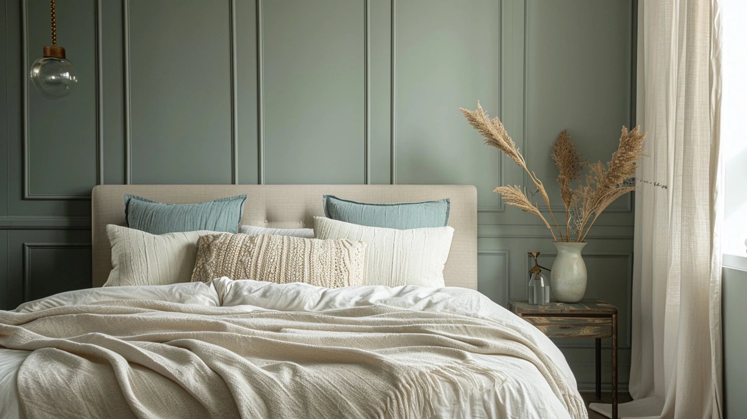
Soft green is reliable because it feels close to nature
Soft green is one of the most dependable bedroom colours because it has a natural, balanced quality. It sits somewhere between freshness and calm. It brings colour into the room without feeling loud, and it works beautifully with the textures bedrooms already need: linen, cotton, wool, wood, rattan, ceramic and soft lighting.
Sage green is the easiest version to live with. It feels gentle, slightly muted and restful. Pair sage with warm white, oatmeal, oak and linen and the room immediately feels calmer. Add small touches of black through a lamp, frame or curtain pole and the scheme gains definition without becoming harsh.
Olive green gives a bedroom more depth. It feels earthier and more grown-up than sage. Olive works well with cream, dark wood, tan leather, aged brass and soft beige. It is a good choice if you want the room to feel restful but not too pale.
For a richer bedroom, deep green can be beautiful. Forest green or smoky green on the walls can feel cocooning, especially with warm lamps, white or cream bedding and natural wood. The trick is not to make everything dark. Let the green create the atmosphere, then give it softness through bedding, curtains, rugs and warm materials.
Blue can be restful, but choose the blue carefully
Muted blue is another strong bedroom choice. Blue can feel cool, clean and restful, especially when it is softened with cream, beige, linen or warm wood. It has a natural connection to sky and water, which is probably why many blue bedrooms feel immediately familiar.
The blue matters, though. Bright primary blue can feel too energetic for a bedroom. Very icy blue can feel chilly, particularly in a north-facing room. Dusty, greyed, chalky or smoky blues are usually easier to live with because they have a softness built into them.
A pale chalky blue with warm white and oak can make a bedroom feel fresh without becoming cold. A dusty blue with taupe and cream feels quieter and more grown-up. A deeper blue with walnut, brass and warm white bedding can feel elegant, almost like a small boutique hotel room.
If you love blue but worry about it feeling cold, add warmth deliberately. Use a warm white rather than a stark white. Choose oak, walnut or rattan rather than lots of chrome or glossy grey. Add a wool throw, linen curtains or a warm-toned rug. Blue is happiest in a bedroom when it has something warm to lean on.
Warm neutrals can be deeply comforting
Warm neutrals work beautifully in bedrooms because they create calm without demanding much from the eye. Oatmeal, stone, taupe, mushroom, warm white and soft beige can all make a bedroom feel cocooning without becoming dark.
The risk with neutrals is that they can feel flat if everything is too smooth or too similar. A neutral bedroom needs texture. Linen bedding, wool throws, woven lampshades, timber bedside tables, a soft rug, boucle, cotton, ceramic lamps and layered curtains all make the palette feel richer. The colour may be quiet, but the surfaces should not be lifeless.
Oatmeal and warm white can feel relaxed and easy. Taupe and mushroom feel a little more sophisticated. Stone and ivory feel clean but soft. Add black or dark bronze in tiny amounts if the room needs definition. A neutral bedroom with no darker note can sometimes feel as if it is floating away.
This is where small details matter. A dark picture frame, a walnut bedside table, a charcoal cushion or a black wall light can give the whole room a stronger shape without disturbing the calm.
Pink can be grown-up when it is earthy or chalky
For a gentle romantic look, plaster pink, clay, soft terracotta and ivory can be beautiful. These colours add warmth and softness without needing to feel sugary. The grown-up version of pink is usually muted, chalky or slightly earthy rather than bright and sweet.
Plaster pink works well because it behaves almost like a warm neutral. It has more life than beige, but it is still soft enough for walls. Pair it with ivory, walnut, linen, stone, brass or dark wood and it becomes elegant rather than girlish.
Clay and soft terracotta bring more warmth. They can make a bedroom feel comforting and sun-baked, especially with cream bedding and natural textures. If you are using terracotta, keep the surrounding colours quiet. Too much orange, rust and pink together can become busy. Let one warm colour lead and keep the rest softer.
A lovely palette for this mood is plaster pink, warm ivory, dark wood and a little burgundy. Another is clay, oatmeal, cream and olive. Both feel warm and romantic, but still grounded.
Darker bedrooms can feel restful, not gloomy
People often assume bedrooms need to be light, but darker colours can be incredibly restful when used well. A bedroom is one of the best rooms for deep colour because you mostly use it at night, when atmosphere matters more than brightness.
Deep green, navy, charcoal, aubergine, chocolate brown and inky blue can all make a bedroom feel like a retreat. The secret is to commit to the mood, then soften it. Dark walls with crisp white bedding can look dramatic. Dark walls with warm white bedding, wood, linen and soft lighting usually feel more comfortable.
If you paint only one wall dark and leave the rest stark white, the contrast can sometimes feel abrupt. In a small bedroom, taking the colour around more of the room can actually feel calmer because there are fewer visual breaks. Even painting the woodwork or wardrobes in a related tone can make the space feel more considered.
Lighting is crucial. A dark bedroom needs warm lamps, not one harsh ceiling light. Bedside lamps, wall lights, dimmers and soft shades will make the colour glow rather than sit heavily.
Think about the colour of the bed itself
In a bedroom, the bed is usually the biggest object in the room, so its colour matters. Bedding can change the entire palette more than people expect. White bedding feels crisp and hotel-like. Cream bedding feels softer. Linen or oatmeal bedding feels relaxed. Dark bedding can feel dramatic, but it can also make the bed visually heavier.
If the walls are coloured, bedding can be the thing that balances them. Sage walls with warm white bedding feel fresh. Navy walls with cream bedding feel softer than navy with stark white. Plaster pink walls with oatmeal bedding feel calmer than pink with bright white. Charcoal walls with linen bedding feel more natural and less severe.
The headboard matters too. A fabric headboard in a colour close to the wall can make the room feel seamless. A darker headboard can create a focal point. A wooden headboard adds warmth. If the room is small, matching the headboard closely to the wall can reduce visual clutter.
Bedrooms need fewer sharp contrasts than other rooms
Contrast is useful, but in a bedroom it usually works best when it is softened. A black-and-white bedroom can look striking, but it may not feel restful if the contrast is too hard. Softer contrast tends to be easier to sleep around: cream and walnut, sage and charcoal, blue and taupe, plaster pink and dark wood, oatmeal and bronze.
This does not mean avoiding dark details. Bedrooms often need a few grounding touches. A black lamp, dark frame, walnut bedside table or charcoal cushion can stop a pale room feeling washed out. The key is to use contrast as punctuation, not as the whole story.
If you want the room to feel calm, avoid too many competing colour moments. A bold rug, bright cushions, patterned curtains, colourful artwork and strong wall colour can all be lovely separately, but together they may feel too lively for a bedroom. Choose the main character and let the rest support it.
Light changes bedroom colours dramatically
Bedroom colour is especially affected by light because the room has to work in very different conditions. It needs to feel pleasant in morning daylight and restful under lamps at night. A colour that looks beautiful in the evening might feel dull in the morning. A colour that looks fresh at midday might feel cold when the lamps are on.
North-facing bedrooms often need warmth. Warm white, taupe, mushroom, plaster pink, olive and soft beige can help. South-facing bedrooms can handle cooler blues, greens and whites more easily because the light is warmer. East-facing bedrooms can be bright early and flatter later, so soft warm colours often work well. West-facing bedrooms may glow beautifully in the evening, which can make warm neutrals, pinks and earthy tones feel especially good.
Always test colours in the room. Paint a large sample or use a board you can move around. Look at it beside the bed, near the window, in the darkest corner and under your bedside lamps. A bedroom colour needs to pass the night-time test as much as the daylight test.
Texture is what makes quiet colours feel luxurious
A bedroom can have a very simple palette and still feel beautiful if the textures are good. In fact, quiet bedroom colours often depend on texture. Linen bedding, cotton sheets, wool throws, velvet cushions, woven blinds, wooden furniture, ceramic lamps and soft rugs all add depth without adding visual noise.
This is why hotel bedrooms often feel calm even when the colours are simple. The palette may be cream, taupe and brown, but the materials do the work. Smooth sheets, heavy curtains, soft carpet, warm lighting and a few darker details make the room feel layered.
If your bedroom palette feels boring, do not immediately add another colour. Add texture first. Swap a flat cushion for linen or velvet. Add a warmer lampshade. Bring in a wooden bedside table. Layer a throw at the end of the bed. Often the colour is fine; the room just needs more touch and softness.
Bedroom colour combinations worth trying
For a calm natural bedroom, try sage green, warm white, oak and soft black. Sage creates the mood, warm white keeps the room light, oak adds warmth and black gives just enough definition.
For a fresh restful bedroom, try dusty blue, cream, taupe and walnut. This is softer than blue and white, and warmer than grey and blue. It feels clean without becoming cold.
For a warm neutral bedroom, try oatmeal, mushroom, ivory and dark bronze. This palette is quiet but not empty. It works well with linen bedding, wool rugs and warm lamps.
For a gentle romantic bedroom, try plaster pink, ivory, dark wood and muted burgundy. Keep the pink chalky and the burgundy restrained so the room feels grown-up.
For a cocooning bedroom, try deep green, cream, walnut and aged brass. The green gives depth, cream softens it, walnut warms it and brass adds a small glow.
For a minimal bedroom that still feels warm, try warm white, pale oak, stone and charcoal. This keeps the room clean but gives it enough contrast to feel designed.
The best bedroom colours feel settled
The best bedroom palette is not necessarily the trendiest or the palest. It is the one that helps the room feel settled. That might mean sage and linen, blue and cream, taupe and walnut, plaster pink and ivory, or deep green and warm brass. What matters is that the colours support the way you want to feel in the room.
A bedroom should not feel like it is performing for guests. It should feel personal, restful and quietly comforting. Start with the kind of rest you want, choose colours that lower the volume, add texture, soften the contrast and test everything in the real light of the room. When the colours are right, the room starts to feel less like a decorated space and more like a place to exhale.