The living room is often the room that has to be the most things at once. It is where you collapse at the end of the day, where people sit when they visit, where the television lives, where books, blankets, coffee cups, toys, flowers and half-finished conversations all gather. It has to feel relaxed, but not neglected. Comfortable, but not shapeless. Social, but still personal. That is why living room colour palettes need a little more thought than simply choosing a wall colour you like.
A good living room palette usually has two sides to it. It needs comfort, because this is a room people actually live in. But it also needs structure, because without structure a living room can start to feel like a collection of separate things rather than one calm, pulled-together space. Colour is what often does that quiet organising work.
Start with the feeling of the room, not the paint chart
Before choosing colours, think about what the living room needs to do. Is it mainly a soft evening room with lamps and deep sofas? Is it a bright family room that needs to cope with noise, mess and movement? Is it a grown-up sitting room for hosting? Is it an open-plan space that has to connect with the kitchen and dining area?
A room used mostly in the evening can handle deeper, warmer and more atmospheric colours. A room used all day may need lighter tones, more natural textures and colours that shift well in changing light. A family living room may benefit from forgiving mid-tones rather than very pale shades everywhere. A more formal sitting room can take stronger contrast, richer colours and a slightly more edited palette.
This is why the same colour can feel perfect in one living room and wrong in another. A deep green can feel cosy and elegant in a lamplit snug, but too heavy in a narrow room with little daylight. A pale neutral can feel airy in a sunny space, but flat in a room that needs warmth and depth.
Warm neutrals are popular because they are forgiving
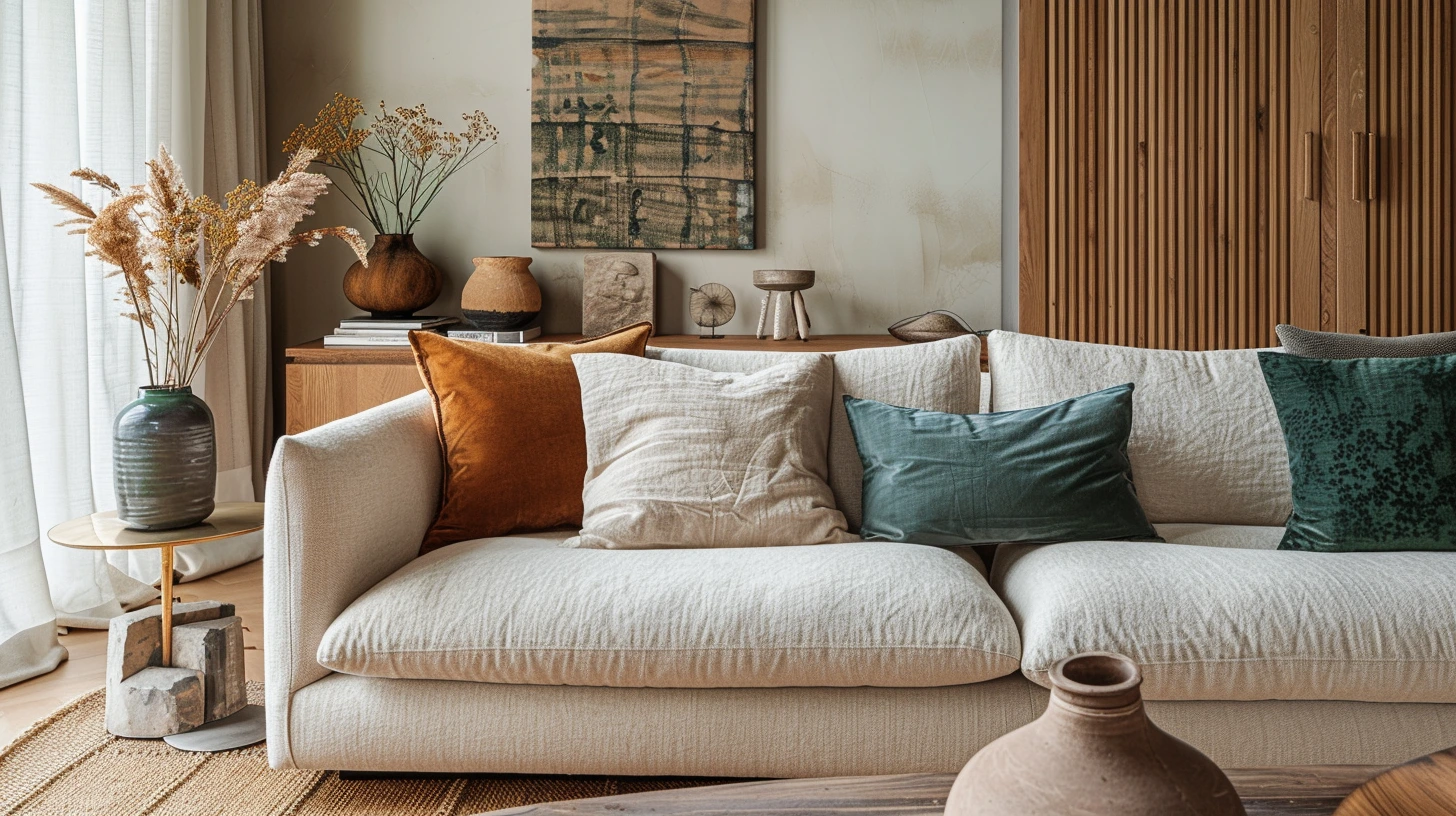
Warm neutrals are an excellent starting point for living rooms because they give the room somewhere calm to begin. Cream, taupe, oatmeal, soft brown, mushroom, stone and warm white all create a base that works with the things living rooms naturally contain: wood, linen, leather, books, plants, ceramics, lamps and textured fabrics.
The reason warm neutrals work so well is that they do not demand too much attention. They make the room feel easy. They let a sofa, artwork, fireplace, rug or view become the focus. They also give you flexibility. You can add sage green for softness, black for definition, rust for warmth, navy for depth or brass for glow without rebuilding the whole palette.
A warm neutral living room might start with cream walls, an oatmeal sofa, a soft brown rug and oak furniture. That could sound plain, but with texture it becomes rich: linen curtains, wool cushions, a ceramic lamp, a woven basket, a wooden coffee table and a few darker picture frames. The palette is quiet, but the room does not feel empty.
Taupe and mushroom are especially useful if you want something more grown-up than beige but softer than grey. They sit beautifully with walnut, black metal, aged brass, olive, ivory and natural stone. They also hide everyday marks better than very pale cream or bright white.
Every living room needs a grounding colour
One of the easiest ways to make a living room feel more finished is to include a grounding colour. This does not have to be black, although black works well. It could be charcoal, espresso brown, deep green, navy, bronze, oxblood or dark walnut. The grounding colour gives the eye somewhere to land.
In a pale living room, grounding might come from a black floor lamp, dark picture frames, a walnut side table or a charcoal cushion. In a warmer room, it might come from dark bronze hardware, a deep brown leather chair or a dark wood cabinet. Without a grounding shade, a living room can feel a little too soft, as if everything is floating.
The trick is to repeat the grounding colour a few times, not just once. A single black lamp can look accidental. A black lamp, black-framed artwork and a slim black curtain pole look intentional. Repetition makes the colour feel like part of the palette rather than an object that wandered in from another room.
Sage green brings softness without making the room dull
Sage green is one of the easiest colours to introduce into a living room because it behaves almost like a neutral. It has colour, but it is gentle. It feels connected to nature, but not overly rustic. It can make a room feel calmer without making it feel sleepy.
Sage works beautifully with warm white, oatmeal, oak, stone, cream, black and soft brown. It can appear on walls, cushions, an armchair, a painted cabinet or even just in artwork and plants. If you are nervous about green, start with textiles and accessories before committing to paint.
A lovely living room palette is warm white walls, oatmeal upholstery, sage accents and black details. It feels calm, natural and modern. Add oak furniture and linen curtains and the room becomes softer. Add brass or dark bronze and it becomes a little more polished.
Olive green is a richer alternative. It has more depth and feels slightly more grown-up. Olive works especially well with cream, tan leather, walnut, terracotta and aged brass. It can make a living room feel warm and grounded, particularly in autumn and winter.
Deep green can make a living room feel expensive
If you want a richer look, deep green is one of the most rewarding living room colours. It feels grounded, sophisticated and comfortable. It can make a room feel like somewhere you want to sit for hours, especially in the evening.
Deep green works beautifully with warm white, aged brass, walnut, tan leather, cream, natural linen and soft lighting. The warmth matters. Without it, dark green can become flat. With it, the colour starts to glow.
You do not have to paint every wall deep green. It can work on a chimney breast, built-in shelving, a media wall, a painted cabinet or a single snug corner. But if the room is naturally cosy and you want atmosphere, taking the green around the whole room can be more successful than one feature wall. Sometimes committing to a colour makes it feel calmer.
To keep deep green liveable, add pale or warm elements: cream lampshades, light artwork, linen curtains, a warm rug or a natural wood coffee table. These details stop the colour feeling too heavy and make the room feel layered.
Navy is smart, but it needs warmth
Navy works beautifully in living rooms because it feels classic without being boring. It has depth, but it is usually easier to live with than black. It pairs especially well with off-white, tan leather, oak, walnut, brass, bronze and warm grey.
A navy living room can go in several directions. With white and brass, it feels crisp and tailored. With tan leather and oak, it feels warmer and more relaxed. With burgundy or rust, it feels richer and more autumnal. With soft grey and cream, it feels calmer and more traditional.
The danger with navy is that it can become too cool. If you use navy walls or a navy sofa, balance it with warmth: wooden furniture, warm white rather than brilliant white, textured rugs, brass lighting or leather. A navy room with only grey, chrome and stark white can feel chilly. A navy room with oak, cream and aged metal feels much more inviting.
Soft blue can create a relaxed living room without going coastal cliché
For a lighter and more relaxed mood, soft blue, chalk white and pale oak can create a fresh living room that nods to coastal style without becoming themed. The key is restraint. You do not need anchors, shells or obvious seaside details. The colours can do the work quietly.
Choose blues that are dusty, chalky or slightly greyed rather than bright. Pair them with warm white, sand, pale oak, linen and woven textures. A muted stripe can look lovely, especially on cushions or a rug, because it adds pattern without shouting.
Soft blue is particularly good in rooms where you want lightness but not blandness. It brings freshness, but if you pair it with warm materials it will not feel cold. Add a little tan, rattan, brass or oatmeal to stop the scheme becoming too pale.
Terracotta and rust can warm up a living room quickly
Terracotta, rust, clay and burnt orange can bring a lot of warmth to a living room. They work especially well when the room already has natural materials: wood floors, linen curtains, leather, stone, ceramics or woven textures.
The key is to use these colours with some restraint. A terracotta cushion, clay vase, rust rug or warm artwork can completely change the mood of a neutral room. You do not necessarily need terracotta walls. In fact, terracotta often works best as a supporting colour rather than the main colour, unless you want a very earthy, sun-baked feel.
Terracotta pairs well with cream, olive, mushroom, taupe, warm white, soft pink, charcoal and natural wood. It also looks beautiful with muted blue because the coolness of the blue balances the warmth of the clay. That contrast can make a living room feel more interesting without making it feel busy.
Do not let the sofa fight the palette
The sofa is usually the largest colour block in a living room, so it has more influence than people expect. A grey sofa, cream sofa, navy sofa, green sofa or tan leather sofa will each lead the room in a different direction.
If your sofa is neutral, you have flexibility. You can bring colour through cushions, rugs, artwork, curtains and paint. If your sofa is a strong colour, let it lead and keep the surrounding palette calmer. A green velvet sofa with busy curtains, bright cushions, a strong rug and coloured walls can become too much very quickly. A green sofa with warm white walls, oak, black details and a few soft cushions can look elegant.
Tan leather is especially useful because it adds warmth and character. It works with navy, green, cream, black, rust, grey, white and wood. It can make a living room feel more relaxed and less showroom-perfect.
Rugs and curtains are part of the colour scheme
Rugs and curtains cover a lot of visual space, so they should be treated as major palette decisions, not afterthoughts. Curtains that are close to the wall colour can make a room feel taller and calmer. Curtains in a strong contrast can frame the windows and add drama. Neither is wrong, but the effect is very different.
In a small or busy living room, curtains in a similar tone to the walls often make the space feel more peaceful. In a larger room, darker or patterned curtains can add depth. Linen curtains in warm white, oatmeal, stone or muted green are easy to live with because they soften the room without dominating it.
Rugs can either pull the palette together or introduce too many new colours. A rug that contains your wall colour, sofa colour and accent colour can make the room feel connected. A rug with five unrelated bright colours may make the room feel chaotic, even if the rug itself is beautiful.
Artwork, books and flowers can carry the playful colour
The easiest mistake in a living room is choosing too many accent colours in the permanent pieces. A living room often looks more expensive when the main palette is slightly restrained. That does not mean the room has to be boring. It means the playful colour can come from things that are easier to change: artwork, books, flowers, cushions, throws and objects.
This is how many beautiful rooms work. The walls, sofa, curtains and rug stay relatively consistent, while smaller details bring life. A neutral room with colourful books and flowers can feel much more natural than a room where every large item is a different statement colour.
Artwork is particularly useful because it can justify a palette. If a painting contains navy, cream, rust and green, those colours can be repeated around the room in small ways. Suddenly the palette feels intentional, not random.
Living room palettes worth trying
For a calm and natural living room, try warm white, oatmeal, sage, oak and soft black. This palette feels relaxed but still has enough contrast to look designed.
For a richer evening room, try deep green, cream, walnut, tan leather and aged brass. It feels grounded, warm and quietly luxurious.
For a smart classic living room, try navy, off-white, warm grey, brass and oak. This works well if you want the room to feel polished without becoming formal.
For a relaxed coastal mood, try soft blue, chalk white, pale oak, sand and woven textures. Keep the styling simple so it feels fresh rather than themed.
For a warm earthy room, try terracotta, mushroom, cream, olive and dark bronze. This gives the room warmth and character without becoming too loud.
For a soft neutral room, try taupe, ivory, oatmeal, walnut and black accents. The palette is quiet, but the darker details keep it from feeling flat.
The best living rooms feel collected, not over-designed
A living room should not feel as though every object arrived from the same catalogue on the same afternoon. The most inviting rooms usually feel collected. They have a consistent palette, but they also have layers: a slightly worn leather chair, a stack of books, a lamp with a warm shade, a rug that softens the floor, a cushion that picks up a colour from the artwork, flowers that change with the season.
Colour helps those layers feel connected. It gives the room a thread. Without that thread, the room can feel cluttered. With it, even a mix of old and new pieces can feel deliberate.
Keep the palette restrained, then let life add colour
The best living room colour palettes usually leave a little room for real life. If the permanent scheme is too busy, everyday objects can tip it into chaos. But if the main colours are calm and consistent, the room can handle books, flowers, people, pets, blankets and the normal mess of living.
That is why restraint often looks more expensive. Choose a base that feels comfortable, add a grounding colour, bring in one or two accents, then let texture and personal objects do the rest. A living room does not need to be perfect. It needs to feel like somewhere people actually want to stay.