Kitchen colours have to work harder than colours almost anywhere else in the home. In a living room, you can change a cushion, move a lamp or swap a rug if something feels slightly off. In a kitchen, the colour might be wrapped around ten cabinet doors, sitting beside a worktop, bouncing off tiles, meeting the floor, catching the light from pendants and sitting behind every mug, bowl and chopping board you own.
That is why a kitchen colour that looks beautiful on a tiny sample can feel very different once it becomes a full run of cabinetry or a large island. The scale changes everything. A soft green can suddenly look much stronger. A white can become colder. A navy can feel richer than expected, or heavier. A black can look incredibly elegant, but only if the rest of the room gives it warmth and texture.
The best kitchen palettes are not just “nice colours”. They feel settled. They make sense with the materials around them. They look good in morning light, under evening lamps, when the counters are clear and when real life has landed on every surface.
Start with the things you are not changing
Before choosing a cabinet colour, look at what is already fixed. Flooring, worktops, tiles, windows, appliances and even the direction of the light will all influence the final effect. A colour does not sit in a kitchen by itself. It reacts to everything around it.
This is where people often go wrong. They choose a colour they love in isolation, then realise it does not quite sit with the floor, or it makes the worktop look too yellow, or it clashes with the tiles they were planning to keep. A sage green cabinet can look soft and natural beside warm oak, but beside a cold grey floor it may look flatter and muddier. A creamy cabinet can look beautiful with limestone, but slightly odd against a very bright white quartz. A blue-black cabinet might look sophisticated in a showroom, then feel too dark in a kitchen with limited daylight.
Worktops are especially important because they sit directly beside the cabinets. A heavily veined stone already brings movement, so it often needs calmer cabinet colours around it. A pale quartz can handle stronger contrast. A wooden worktop instantly warms up cooler colours. Concrete, terrazzo, marble and granite all have their own undertones, and those undertones matter.
Think of the kitchen as a group of materials first and a colour scheme second: wood, stone, ceramic, metal, paint, glass, fabric and light. When those materials agree with each other, the kitchen feels designed rather than assembled.
Warm white and oak: the kitchen combination that rarely lets you down
Warm white and oak is popular because it solves a lot of problems at once. It feels clean, but not cold. It feels modern, but not harsh. It feels natural, but not rustic unless you push it that way. It gives you brightness and warmth in the same palette, which is exactly what many kitchens need.
The key is choosing the right white. A stark, blue-toned white can make oak look more yellow and can leave the room feeling a little clinical. A warmer white, soft ivory, chalky cream or pale stone tends to sit more comfortably with wood. It still gives you that fresh kitchen feeling, but it has more softness.
Oak brings the part that white often lacks: life. It adds grain, warmth and texture. A kitchen with warm white cabinets, oak shelves, pale stone worktops and brushed brass handles can feel calm and timeless. Swap the brass for black handles and the same palette feels sharper and more contemporary. Add terracotta pots, linen blinds or handmade tiles and it becomes warmer and more relaxed.
This is why warm white and oak is such a useful base. It gives you freedom. You can style it softly with sage and cream, more dramatically with black and stone, or more naturally with rattan, clay and olive.
Green kitchens feel popular because they do not feel like a gimmick
Green has become one of the most loved kitchen colours because it manages to feel both current and familiar. It has enough personality to feel like a choice, but because it is connected to nature, it rarely feels as risky as brighter colours.
Sage green is the gentle version. It works well if you want a kitchen to feel fresh, calm and easy to live with. Pair it with oak, warm white, cream tiles, limestone, rattan, brass or pale stone and it becomes soft without feeling bland. Sage is especially good when you want more character than white, but still want the room to feel light.
Olive green feels more grounded. It has a richer, earthier quality and works beautifully with aged brass, dark wood, cream walls and natural stone. It can make a kitchen feel warmer and more lived-in, especially if you like open shelving, ceramics, woven textures and soft lighting.
Forest green is the dramatic one. It can make a kitchen feel expensive and established, particularly with marble, limestone, walnut, aged brass or warm white walls. But forest green needs balance. If you use it everywhere, make sure the room has enough natural light, reflective surfaces or pale contrast. If you are nervous, use it on lower cabinets, an island or a pantry wall rather than across every unit.
Green kitchens work best when they are allowed to feel natural. They do not need lots of competing colours. Wood, stone, cream, brass, black and handmade textures usually give green everything it needs.
Navy makes a kitchen feel smart without trying too hard
Navy has a very particular kind of confidence. It is dark, but not as severe as black. It feels classic, but not old-fashioned. It works in traditional shaker kitchens and in sleek modern spaces. It can make a kitchen feel settled, tailored and grown-up.
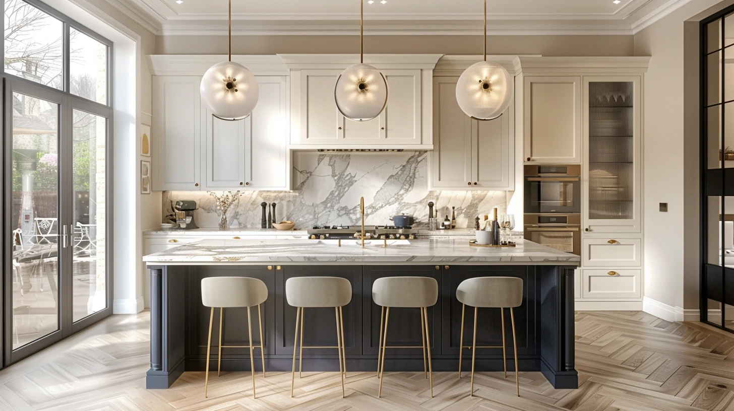
Navy pairs beautifully with white quartz, marble, warm wood, brass, bronze, cream walls and patterned tiles. It has enough depth to anchor a kitchen, especially if the rest of the space is light. A navy island in a pale kitchen can look particularly good because it creates a clear focal point without overwhelming the room.
The thing to watch with navy is weight. Navy cabinets, dark flooring, dark worktops and limited light can make a kitchen feel heavy very quickly. To avoid that, give navy some lift. Pale walls, warm lighting, oak flooring, brass handles, white stone or open shelving can all help.
One of the easiest ways to use navy well is to keep it low. Navy lower cabinets with lighter upper walls or shelves give you the richness without closing the room in. It is a good compromise if you want drama, but still want the kitchen to feel bright and usable during the day.
Black kitchens can be beautiful, but they need humanity
A black kitchen can look incredibly elegant. It can also look cold if it is treated too harshly. The difference usually comes down to warmth and texture.
Black with oak, soft white, stone and warm lighting can feel refined and calm. Black with glossy surfaces, cold white light and no texture can feel severe. The colour itself is not the problem; it is what you put around it.
Matte black is often easier to live with than high gloss black because it feels softer and more architectural. It absorbs light rather than bouncing it around, which can make the kitchen feel grounded. But because it absorbs light, it needs warmth elsewhere. Wooden stools, pale stone worktops, linen blinds, ceramic tiles, brass pendants or even chopping boards left out on the counter can all make black feel more human.
If a full black kitchen feels too much, use it as an accent. Try black lower cabinets, a black island, black handles, black window frames or a black pantry wall. You still get the definition, but the room does not become dominated by one dark surface.
Two-tone kitchens are useful when one colour feels too much
Two-tone kitchens can solve a lot of colour anxiety. If you love a stronger shade but worry about living with it everywhere, use it on the lower cabinets or island and keep the upper part of the room lighter. This grounds the kitchen without making it feel top-heavy.
Sage lower cabinets with warm white walls feel fresh and calm. Navy lower cabinets with oak shelves feel smart but not heavy. Charcoal lower cabinets with pale stone and cream walls feel modern and practical. A forest green island in an otherwise warm white kitchen gives you colour, but keeps the space open.
The secret is to repeat the darker colour somewhere else, even in a small way. A pendant light, bar stool, picture frame, tap, tile detail or door colour can echo the cabinet shade. Repetition makes the split look intentional rather than like two separate decisions.
Hardware quietly changes everything
Handles, taps and lighting might seem like finishing touches, but they can change the entire mood of a kitchen. Brass makes colours feel warmer. Chrome feels cleaner and cooler. Black adds definition. Bronze feels softer and more aged. Nickel sits somewhere between crisp and classic.
With warm white and oak, brass makes the kitchen feel softer and more relaxed, while black hardware makes it feel more graphic. With green cabinets, aged brass often looks beautiful because it brings out the warmth in the green. With navy, brass feels classic, chrome feels sharper and black feels more contemporary. With black cabinets, brass or bronze can stop the scheme feeling too stark.
You do not need every metal to match perfectly, but they should feel like they belong to the same story. A chrome tap and nickel handles can sit together. Brass pendants and bronze handles can feel related. Chrome, yellow brass, black and copper all fighting for attention in one small kitchen can start to feel messy.
Tiles can make or break the palette
Tiles are often where a kitchen gains charm. They catch light, add texture and bring personality. But they can also complicate the palette very quickly.
If the cabinets are already a strong colour, a calmer tile is usually safer. Handmade white, cream, pale stone, soft green or lightly textured tiles can add movement without stealing the show. If the cabinets are simple, the tiles can take more of the personality. A patterned floor, zellige-style splashback or marble slab can become the thing that makes the kitchen memorable.
The floor matters here. A patterned floor and a patterned splashback can work, but only if the rest of the kitchen is calm. If the floor already has a lot going on, a quieter splashback gives the eye somewhere to rest. If the floor is plain, the splashback can carry more interest.
Kitchen palettes that tend to work beautifully
Warm white, oak, pale stone and brushed brass is a calm, timeless combination. It feels bright without being cold and warm without becoming rustic. It is also easy to update with accessories, artwork, stools or ceramics.
Sage green, warm white, oak and black accents feels fresh and modern. Sage gives the room character, white keeps it light, oak softens it and black stops everything becoming too gentle.
Navy, white quartz, brass and walnut feels smart and classic. Navy gives depth, quartz brings brightness, brass adds warmth and walnut makes it feel more relaxed than a very formal navy-and-white scheme.
Olive green, cream, terracotta and natural wood feels earthy and lived-in. It is especially good if you like kitchens that feel warm, relaxed and a little Mediterranean without becoming themed.
Black, soft white, oak and pale stone feels dramatic but liveable. The black adds structure, while the oak and stone stop it feeling too hard.
Mushroom, warm white, brass and marble is a softer alternative to grey. Mushroom tones are useful because they sit between beige, grey and taupe, which means they often work with a wide range of materials.
Think about the kitchen after dark
Kitchens are often chosen in daylight, but many of us use them most in the evening. This is where lighting becomes part of the colour palette. Under-cabinet lighting, pendants, wall lights and warm bulbs can completely change how a kitchen feels.
A navy or green kitchen can look beautiful at night with warm lighting. A white kitchen can feel cosy if the light is soft rather than stark. A black kitchen almost depends on layers of light, otherwise the surfaces can disappear into shadow. If the kitchen has a dining area, softer lighting helps it feel like part of the home rather than just a workspace.
One bright ceiling light is rarely enough. It can flatten colours and make even expensive materials look harsh. A kitchen usually feels better when the lighting is layered: practical light where you cook, softer light where you eat, and a little glow where you want atmosphere.
Samples matter more in kitchens than almost anywhere else
Because kitchen colour appears across large, expensive and permanent surfaces, samples are not optional. A cabinet colour can look subtle on a small door sample and surprisingly strong across an entire wall. A worktop can look clean in a showroom and too stark at home. A brass handle can look warm by itself and too yellow beside a particular cabinet colour.
Put everything together before deciding: cabinet sample, worktop sample, floor, tile, wall colour and handle finish. Look at them in natural light and artificial light. Hold cabinet colours vertically and worktop samples horizontally, because light hits them differently. This sounds fussy, but it can save you from very expensive disappointment.
Timeless does not have to mean plain
People often choose white or grey because they want the kitchen to last. There is nothing wrong with that, but safe does not have to mean characterless. Warm white, stone, mushroom, sage, olive, navy and soft black can all feel timeless when they are used with the right materials.
A kitchen dates less because of colour itself and more because the whole palette feels disconnected from the room. If the cabinets, worktop, floor, light and hardware all make sense together, the kitchen will usually feel settled for longer.
The best kitchen colours are the ones that still feel good in real life: when the morning light hits the counter, when the lamps are on in the evening, when people are standing around talking, when the room is not perfectly tidy. Start with the fixed materials, choose colours that work at scale, add warmth through wood or metal, and use contrast carefully. That is how a kitchen starts to feel not just decorated, but properly lived in.