The usual advice is that small rooms should always be painted white, but that is only partly true. White can help, especially if the room already has good natural light, but it is not a magic trick. In some small rooms, bright white can look fresh and airy. In others, it can feel cold, thin or unfinished. The real question is not “what colour makes a room bigger?” but “what colour makes this room feel better?”
A small room has less space to hide mistakes, so every colour choice is more noticeable. The walls, ceiling, skirting boards, curtains, flooring and furniture all sit closer together visually. That means undertone, contrast and lighting matter just as much as the shade itself. A soft warm white may open the room up beautifully, while a cooler white might make the same space feel harsh. A pale greige might feel calm and expensive, while a flat grey could make the room feel dull.
White is not the only answer
White works best when it has something to bounce off: natural light, good texture, warm flooring, artwork, plants, books, wood, or strong shapes in the room. Without those things, a small white room can sometimes feel more like an empty box than a bigger space.
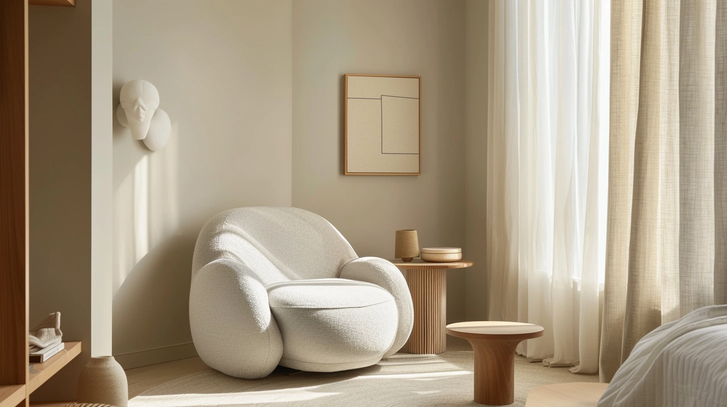
Soft warm whites are often easier to live with than brilliant white. They reflect light but still have a little warmth. This is especially useful in bedrooms, hallways and small living rooms where you want the room to feel gentle rather than stark. A warm white beside oak, rattan, linen or brass can make a compact room feel calm and quietly polished.
Pale stone, light taupe, gentle greige and muted pastels can also help a small room feel brighter without making it feel clinical. These colours still reflect light, but they give the room more personality. A tiny bedroom in pale stone can feel restful. A small office in muted sage can feel focused and calm. A compact bathroom in soft blue can feel fresh without becoming icy.
Low contrast can make a room feel calmer and larger
Low contrast is often more important than choosing the palest possible colour. When walls, curtains, skirting boards, doors and large furniture are in related tones, the eye moves around the room more easily. Nothing abruptly stops your attention. The space feels smoother and less chopped up.
For example, a small bedroom with warm white walls, oatmeal curtains, pale wood furniture and a cream headboard will often feel larger than the same room with white walls, black curtains, dark furniture and a high-contrast rug. The second room might be more dramatic, but the eye keeps hitting visual boundaries. In a small room, those boundaries can make the space feel tighter.
This does not mean everything needs to match perfectly. In fact, a room where every colour is identical can feel flat. The trick is to keep the colours close enough to feel connected. Warm white, ivory, oatmeal and pale beige can work together. Soft grey, blue-grey, misty blue and white can work together. Sage, stone, cream and pale oak can work together. The differences are there, but they are gentle.
Paint the woodwork with the room, not against it
One of the simplest ways to make a small room feel more considered is to continue a similar colour onto the woodwork, built-ins or doors. White skirting boards against coloured walls can create a strong outline around the room. Sometimes that contrast looks crisp, but in a very small space it can also draw attention to every edge.
If you paint the skirting boards, door frames, radiators or built-in cupboards in the same colour as the walls, or just a slightly different tone, the room feels less interrupted. Built-ins can almost disappear. Doors feel less dominant. Awkward corners become less obvious. It is not that the room is physically bigger, but it becomes visually quieter.
This works particularly well in small bedrooms, box rooms, hallways and home offices. A tiny office painted in one soft green across walls, shelves and woodwork can feel calm and intentional. A small bedroom in warm taupe with matching wardrobes can feel more like a boutique hotel room than a spare room squeezed into a corner.
Do not ignore the ceiling
The ceiling is often forgotten, but in a small room it can make a real difference. A bright white ceiling with darker walls can sometimes make the room feel taller because it lifts the eye. But in other rooms, the white ceiling creates a hard line that makes the walls feel lower.
For a soft, wrapped effect, try painting the ceiling in the same colour as the walls, especially if the colour is pale or mid-toned. This can blur the edges of the room and create a more seamless feeling. It works beautifully with warm whites, pale greige, soft pink, powder blue, sage and mushroom tones.
For a cosy small room, a darker ceiling can also work. This is not for every space, but in a snug, reading room or dramatic bedroom, taking a deep colour over the walls and ceiling can feel cocooning rather than cramped. The room stops pretending to be large and becomes atmospheric instead.
Small rooms can handle dark colours
Darker colours can absolutely work in small rooms when the aim is atmosphere rather than visual expansion. Not every small room needs to feel bigger. Some small rooms are better when they feel intimate, rich and enclosed. A cloakroom, snug, reading corner, guest bedroom or hallway can look incredible in deep green, navy, charcoal, aubergine, chocolate brown or oxblood.
The reason dark colours work in small rooms is that they can hide the edges. Instead of seeing every wall clearly, the room becomes more about mood. Add warm lighting, a mirror, a glossy tile, a brass fitting, framed artwork or a pale lampshade and the space starts to glow.
A small cloakroom in dark green with brass, a patterned floor and a warm wall light can feel far more special than the same room painted plain white. A tiny bedroom in deep blue with cream bedding and wood tones can feel restful and elegant. A small snug in chocolate brown or charcoal can feel like a retreat.
The light decides more than the paint card does
Before choosing a colour, look at the light. A north-facing small room may already feel cool, so a pure white or blue-grey can make it feel even colder. In that case, warm white, pale taupe, soft beige, muted peach, plaster pink or gentle greige may be more flattering.
A south-facing small room usually has warmer, stronger light, so it can cope with cooler whites, pale blues, greens and even slightly stronger colours. East-facing rooms can feel bright in the morning but cooler later in the day. West-facing rooms can look plain earlier but glow beautifully in the evening.
This is why testing matters. Paint a large sample or use a movable board. Look at it near the window, in the darkest corner, beside the flooring and next to any big furniture. A colour that looks perfect online can behave completely differently once it is surrounded by your light, your carpet, your sofa and your curtains.
Use furniture colour to keep the space flowing
In a small room, furniture can either help the palette or break it up. Large dark furniture against pale walls can look stylish, but it can also make the room feel more crowded if there are too many strong blocks. If you want the room to feel open, choose at least some furniture close to the wall colour or floor tone.
A pale sofa against a pale wall can make a compact living room feel softer. A bed frame in a similar tone to the wall can make a small bedroom feel less busy. Built-in storage painted to match the walls can be a game-changer because it gives you storage without adding visual weight.
Transparent, reflective or leggy furniture can help too. A glass table, slim metal legs, mirrors, light wood, woven chairs and wall-mounted shelves all allow the eye to travel further. Heavy furniture that sits directly on the floor can make a room feel more packed, especially if it is dark and bulky.
Mirrors help, but only if they reflect something good
Mirrors are often recommended for small rooms, and they can work beautifully. But a mirror is only as good as what it reflects. If it reflects a window, a lamp, artwork or a calm part of the room, it can add light and depth. If it reflects clutter, a doorway or a busy shelf, it may just double the visual noise.
Try placing a mirror opposite or near a light source, or use one above a console table, fireplace or small chest. In a narrow hallway, a mirror can stop the space feeling closed in. In a small bedroom, mirrored wardrobe doors can work if the rest of the room is kept calm and not too cluttered.
Colour combinations that work well in small rooms
For a small room that needs to feel light and calm, try warm white, pale oak, oatmeal and sage. The warm white opens the space, oak adds warmth, oatmeal softens the scheme and sage brings a natural note.
For a small bedroom, try plaster pink, cream, mushroom and dark wood. This feels soft but not childish. The mushroom tone keeps it grounded, while the dark wood adds depth.
For a tiny home office, try muted green, warm white, black and natural wood. Green feels focused and restful, while black details stop the space becoming too gentle.
For a compact bathroom, try soft blue, white, stone and brushed brass. The blue feels fresh, the stone adds warmth, and brass gives the room a little polish.
For a dramatic cloakroom, try deep green, burgundy, charcoal or navy with warm lighting and metallic accents. Small spaces like cloakrooms can take this kind of drama because you do not spend hours in them. They can feel like a surprise moment in the house.
For a narrow hallway, try one continuous colour across walls and woodwork. Warm white, pale greige, soft olive, mushroom or light taupe can all work. Add contrast through art, lighting or a runner rather than chopping up the walls with lots of different colours.
Pattern can help if the colours are controlled
People often avoid pattern in small rooms because they worry it will make the space feel busy. But pattern can actually help if the colours are controlled. A wallpaper with two or three related tones can add depth and charm. A patterned rug can bring the palette together. Striped fabric can make a room feel taller or longer depending on how it is used.
The key is not to introduce too many new colours through the pattern. If your room is soft green, cream and oak, choose a pattern that repeats those tones rather than bringing in six extra shades. Pattern works best in small rooms when it supports the palette instead of taking over.
Clutter changes the colour story
Small rooms are less forgiving of clutter, and clutter has colour too. Books, toys, cables, product packaging, clothes, paperwork and random objects all add visual noise. Sometimes a room does not need a new paint colour; it needs fewer competing colours on show.
Baskets, closed storage, simple trays, matching boxes and edited shelves can make the colour palette feel calmer. This is not about making the room sterile. It is about letting the colours you chose have a chance to work.
The best colour is the one that suits the room’s personality
The biggest visual effect often comes from reducing interruption. Similar tones on walls, woodwork and doors. Furniture that does not fight the wall colour. Curtains that blend rather than slice the room in half. A ceiling that feels connected. A few moments of contrast, but not so many that the room becomes jumpy.
But small rooms do not all need the same treatment. Some should feel open and airy. Others should feel cosy, moody or jewel-box-like. A tiny room painted pale because you think it “should” be pale can feel disappointing if what it really wants is atmosphere. A small room painted dark can feel wonderful if you commit to the mood and light it properly.
So yes, light colours can make a small room feel bigger. But the better answer is more interesting: use low contrast, pay attention to undertones, test the light, reduce visual interruptions and decide whether you want the room to feel larger, calmer or more atmospheric. Once you know that, the colour choice becomes much easier.