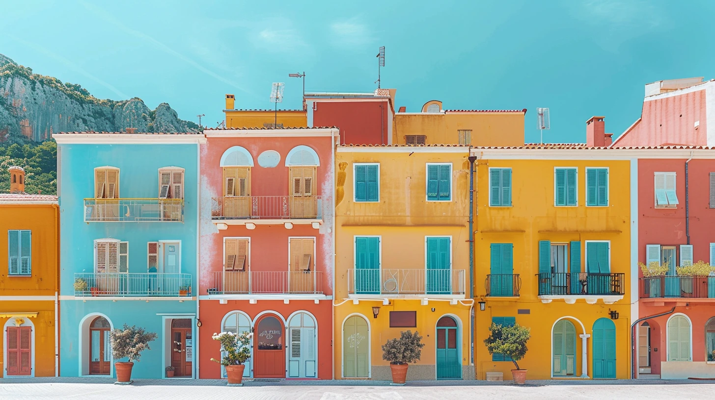
Travel is one of the richest sources of colour because a place is never just one hue. The coast is not simply blue. It includes stone, painted doors, citrus, umbrellas, shadows and evening light. A desert is not simply beige. It contains iron reds, warm pinks, dry grasses and deep brown shadow. The most convincing place-inspired palettes capture those relationships rather than searching for a single “signature colour”.
Look for repeated materials
Architecture and landscape often share a palette because local materials repeat across buildings, roads and interiors. Limestone, volcanic rock, timber, plaster, clay tiles and metal roofs create a background colour system before nature is even considered.
When building a destination palette, start with one ground material, one natural feature, one human-made accent and one light neutral. That usually creates a more believable result than sampling five bright colours from a postcard.
Weather changes the same colours
Scottish greens under overcast light feel different from tropical greens under direct sun. Icelandic blue can look mineral and grey; Mediterranean blue often appears clearer and more saturated. If a palette is meant to evoke a place, brightness and saturation are as important as hue.
This is also why travel palettes translate well into interiors. The relationship between colour and light is already part of the inspiration.
Avoid reducing a culture to a cliché
A place can contain many legitimate palettes. Kyoto in spring, summer, autumn and winter will produce different colour stories. Marrakech at dawn, inside a riad and in a spice market will not look the same. Treat these palettes as visual interpretations, not definitions of a country or culture.
That approach keeps the work respectful and gives designers more creative freedom.
Use place palettes across different projects
Travel-inspired palettes are useful for editorial graphics, destination branding, hospitality, interiors, weddings and product photography. The same Amalfi palette can feel lively in a travel article and restrained in a bathroom if the orange is reduced to a small accent.
Scale and proportion matter. The palette gives you the ingredients; the project determines the recipe.
Explore the ten destinations
The collection below ranges from sunlit coastal palettes to glacial blues, autumn maples, desert minerals and rainforest greens. Each is designed as a usable five-colour system rather than a literal photograph sample.
Keep exploring colour
Continue from this article into related palettes and colour guides already available on Palette Burst.