Choosing colours for a room is rarely just about finding shades that look nice together. It is much more personal than that. Colour changes the way a room behaves. It can make a kitchen feel brighter on a grey morning, a living room feel more sociable in the evening, or a bedroom feel like somewhere your shoulders finally drop. That is why picking a palette can feel surprisingly emotional. You are not only decorating a room; you are shaping the atmosphere you live in.
The trick is not to start with a perfect colour chart. Start with the feeling. Do you want the room to feel calm, grown-up, cheerful, cocooning, elegant, fresh, earthy, playful or quietly luxurious? Once you know that, the colour choices become much easier. A calm room might lean towards warm whites, soft greens, oatmeal and gentle blues. A dramatic room might need deep green, navy, burgundy or charcoal. A warm, sociable room might come alive with terracotta, honey, brass, rust or clay.
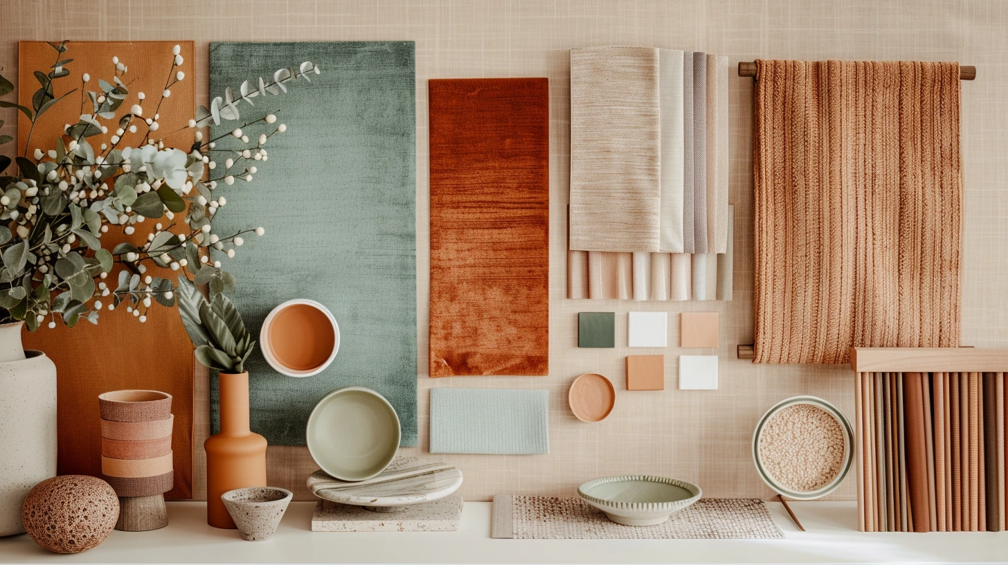
Think of the room like a conversation
A good room is a bit like a good conversation. Not every colour needs to speak at the same volume. Some colours should do the quiet background work. Others can add character. One or two can make the room memorable. If every shade is shouting, the room feels restless. If every shade whispers, it can feel unfinished.
For example, warm white, oatmeal and muted olive create a calm, natural room because none of those colours are trying too hard. Warm white keeps the space light, oatmeal makes it softer, and olive gives it a little life. It is the sort of palette that works well if you want a room to feel relaxed but still considered.
Navy, soft grey and brass tell a different story. Navy brings confidence, soft grey keeps it steady, and brass adds a glimmer of warmth. That combination can make a study, hallway or dining room feel more polished. It feels smart because the colours have different jobs: depth, balance and glow.
Terracotta, cream and dusty pink feel warmer and more expressive. Terracotta brings the earthiness, cream keeps everything breathable, and dusty pink softens the edges. It is a lovely choice when you want warmth without going full orange or making the room feel too themed.
Look at colours that already live well together
Nature is still one of the best places to steal colour ideas from. Stone, clay, sand, moss, bark, linen, slate and soft blue all sit comfortably together because we are used to seeing them together. They feel familiar before we even think about them. That is why nature-led palettes are so easy to live with.
A room built around stone, linen and moss can feel restful without being boring. Add oak, woven baskets, ceramic lamps or a jute rug and the whole thing starts to feel layered rather than decorated. A sand and clay palette feels sunnier and warmer, especially if you bring in black metal, dark wood or charcoal to stop it becoming too soft.
Soft blue is another useful colour because it can go in several directions. With warm white and oak, it feels fresh and gentle. With navy and crisp white, it feels more classic. With terracotta, it suddenly feels more interesting because the coolness of the blue balances the warmth of the clay. That little push and pull is often what makes a room feel alive.
The colours you do not notice often matter most
People often focus on the obvious colours: the painted wall, the sofa, the rug. But the quieter colours in a room matter just as much. The colour of the floor. The undertone of the curtains. The metal on the lamp. The black line around a picture frame. The creaminess of a lampshade. These small details can either pull a palette together or make it feel slightly off.
This is why two beige rooms can feel completely different. One beige might have a warm, creamy undertone and look beautiful with oak, rust and olive. Another might have a grey undertone and sit better with charcoal, blue and cooler greens. On a screen, they may both look like “neutral”. In a real room, they behave very differently.
If you already have a warm wooden floor, colours like cream, sage, terracotta, mushroom, navy and olive often sit naturally with it. If your floor is cooler or greyer, you might find that blue-grey, soft white, charcoal, muted teal or greige behave better. If you have red brick, try deep green, warm white, tan, navy or earthy browns. The fixed features of the room are already part of the palette, even if you did not choose them.
A dramatic room still needs softness
Deep colours can be beautiful, but they usually need something gentle beside them. Dark green with warm wood feels rich and cocooning. Deep blue with off-white feels crisp and confident. Burgundy with blush feels grown-up and intimate. The reason these combinations work is not just because the colours match; it is because the lighter or warmer shade gives the darker one somewhere to breathe.
A room painted entirely in a strong colour can look stunning in photos, but in everyday life it needs balance. Soft curtains, pale artwork, warm lamps, natural textures and lighter upholstery can all stop the room from feeling heavy. Think of dark colour as atmosphere, not punishment. It should invite you in, not swallow the room whole.
If you are nervous about dark colours, use them in places where they feel deliberate: a chimney breast, a bookcase, a downstairs loo, a dining room wall, a painted door, a headboard wall or a small snug. Smaller spaces can often handle strong colour better than large open rooms because they already have a sense of enclosure.
Every room has its own colour appetite
Some rooms want quiet colours. Some can take more drama. A bedroom usually benefits from colours that feel gentle at the end of the day: muted blue, sage, taupe, warm white, soft brown, plaster pink or smoky lavender. A living room often needs more flexibility, because it has to work for lazy Sundays, guests, TV evenings and everyday mess. That is where layered neutrals with one or two character colours can be useful.
Kitchens often suit colours that feel clean but not clinical. Cream, warm white, pale green, navy, oak, stone and brass all work because they feel fresh while still having warmth. Bathrooms can go in two directions: light and spa-like with stone, white, blue and soft green, or dramatic and boutique with charcoal, deep green, brass and marble.
Hallways are interesting because they are not rooms you sit in for hours. That means they can take a little more personality. A deeper colour, patterned runner, painted bannister or bold artwork can make a hallway feel like an introduction to the home rather than just a corridor.
Try building a palette from a memory
One of the nicest ways to choose colours is to start with a place or memory rather than a paint chart. A walk on the coast might give you chalk white, wet stone, sea blue and driftwood. A favourite old pub might give you oxblood, dark wood, brass and cream. A summer garden might give you sage, soft pink, clay pots and warm gravel. A city hotel might give you navy, marble, walnut and smoked glass.
This makes the palette feel less random. Instead of asking, “Do these colours match?” you are asking, “Does this room feel like the mood I had in mind?” That is much more useful. It also helps you avoid copying trends too literally. The room starts to feel like it belongs to you.
Some colour combinations worth trying
For a calm natural living room, try warm white, oatmeal, sage and soft black. This gives you light, softness, a natural note and enough contrast to stop the room drifting into blandness. Use sage in cushions, artwork, painted furniture or a chair if you do not want it on the walls.
For a richer, more evening-friendly room, try deep green, tan leather, warm wood and cream. It feels classic without being stiff. Add brass or aged bronze if you want it to feel more layered.
For a modern earthy room, try terracotta, mushroom, warm white and olive. This works particularly well with ceramics, linen, wood and woven textures. It feels warm, but still grown-up.
For a fresh bedroom, try dusty blue, warm white, taupe and walnut. The blue keeps the space calm, the taupe stops it feeling cold, and the walnut adds depth. It is a good alternative to the usual grey bedroom.
For a soft but elegant room, try plaster pink, burgundy, cream and dark wood. The key is keeping the pink muted and chalky. If it becomes too sweet, add more cream, brown or black to ground it.
For a clean, coastal-feeling space, try soft blue, sand, white and weathered grey. The important part is restraint. Too many seaside references can make a room feel themed, but a few coastal colours can make it feel fresh and open.
Light is the part people underestimate
Light changes colour more than almost anything else. A warm beige in one room can look dull and grey in another. A beautiful deep green might feel cosy at night but too heavy in the morning. A soft pink might glow in warm light and look flat in a colder room. This is why it is risky to choose a colour from a screen and commit straight away.
Test colours in the actual room. Paint a large sample or use a movable sample board. Look at it in the morning, afternoon and evening. Put it near the floor, near the window and next to your sofa or curtains. You are not just testing the colour. You are testing the relationship between the colour, the light and the things already in the room.
North-facing rooms often need extra warmth because the light can be cooler. South-facing rooms can handle cooler or stronger colours because they get more warmth from the sun. East-facing rooms can look bright in the morning and flatter later. West-facing rooms can become golden towards evening, which can make warm colours look richer.
Do not forget texture
Colour never appears on its own. A navy velvet sofa does not feel the same as a navy painted wall. A sage linen curtain does not feel the same as a sage gloss cabinet. A cream boucle chair feels different from a cream cotton blind. Texture changes the way colour lands.
If a palette feels a little flat, you may not need another colour. You might need more texture. Linen, wool, velvet, rattan, oak, ceramic, marble, brass, matte paint and woven rugs can make a simple palette feel layered. This is especially useful with neutral rooms. A neutral room without texture can feel empty; a neutral room with texture can feel calm and expensive.
A good room usually has a little tension
The most interesting rooms often have one small surprise. A very calm room with a black lamp. A neutral sofa with a rust cushion. A pale kitchen with a deep green island. A traditional room with a sharp modern artwork. A soft bedroom with a dark wood bedside table. This little bit of tension stops the room feeling too perfect or showroom-like.
That does not mean adding a random bright colour just for the sake of it. It means giving the room a point of view. Something that makes the palette feel intentional. Something that makes people remember it.
The best palette is one you can live with
Trends can be useful, but the best interior colour combinations are the ones that still feel good when the room is messy, when the weather is grey, when the lamps are on, and when you have lived with them for a while. A room does not need to impress everyone immediately. It needs to support the life happening inside it.
So start with the mood, notice the light, respect the colours that are already there, and give each shade a reason to belong. If one colour leads, one colour softens, one colour grounds and one colour adds interest, you are already most of the way there. The room will feel less like a collection of nice things and more like a place with its own atmosphere.